Plain painted walls are like plain toast: totally fine, but also begging for butter, jam, or at least a little drama.
Decorative wall painting techniques let you add texture, depth, pattern, and “Wait… you did that with paint?”
energywithout committing to permanent plaster work or wallpaper regret.
Below are 16 tried-and-true techniques used by homeowners, designers, and pros. You’ll get what the finish looks like,
where it works best, what tools you need, and the biggest “please don’t do this at midnight the night before guests arrive”
mistakes to avoid.
Before You Start: Prep & Strategy (The Not-Fun Part That Makes It Look Expensive)
1) Pick the right wall and lighting
Decorative finishes love good lighting. Raking light (light that slides across the wall from a window or sconce) emphasizes texture
and brush movementgreat for limewash, plaster looks, and metallics. It can also expose every bump and roller line if prep is sloppy.
If your wall has dents, patch and sand now, not later while whispering motivational quotes at a drying glaze.
2) Choose paint sheen with intention
In general: matte/flat hides surface flaws, eggshell/satin cleans easier. Decorative techniques often use a flat base coat so the effect
reads softer and more layered. Metallic and glazed finishes can be more reflective, so test in your room’s light.
3) Do a sample board first
Make a poster-board or foam-board sample (at least 18" x 18"). Test your base coat, your effect coat, and your topcoat (if any).
Hold it against the wall in morning, afternoon, and evening light. This tiny step prevents the classic DIY plot twist:
“It looked dreamy at noon and… swampy at 8 p.m.”
4) Work in manageable sections
Techniques that require blendinglike ombre, color washing, and faux concretereward speed and consistency.
Plan your stopping points at natural breaks (corners, doors, trim lines). If you stop mid-wall, you may create a visible “seam,”
like your wall is wearing a poorly matched foundation shade.
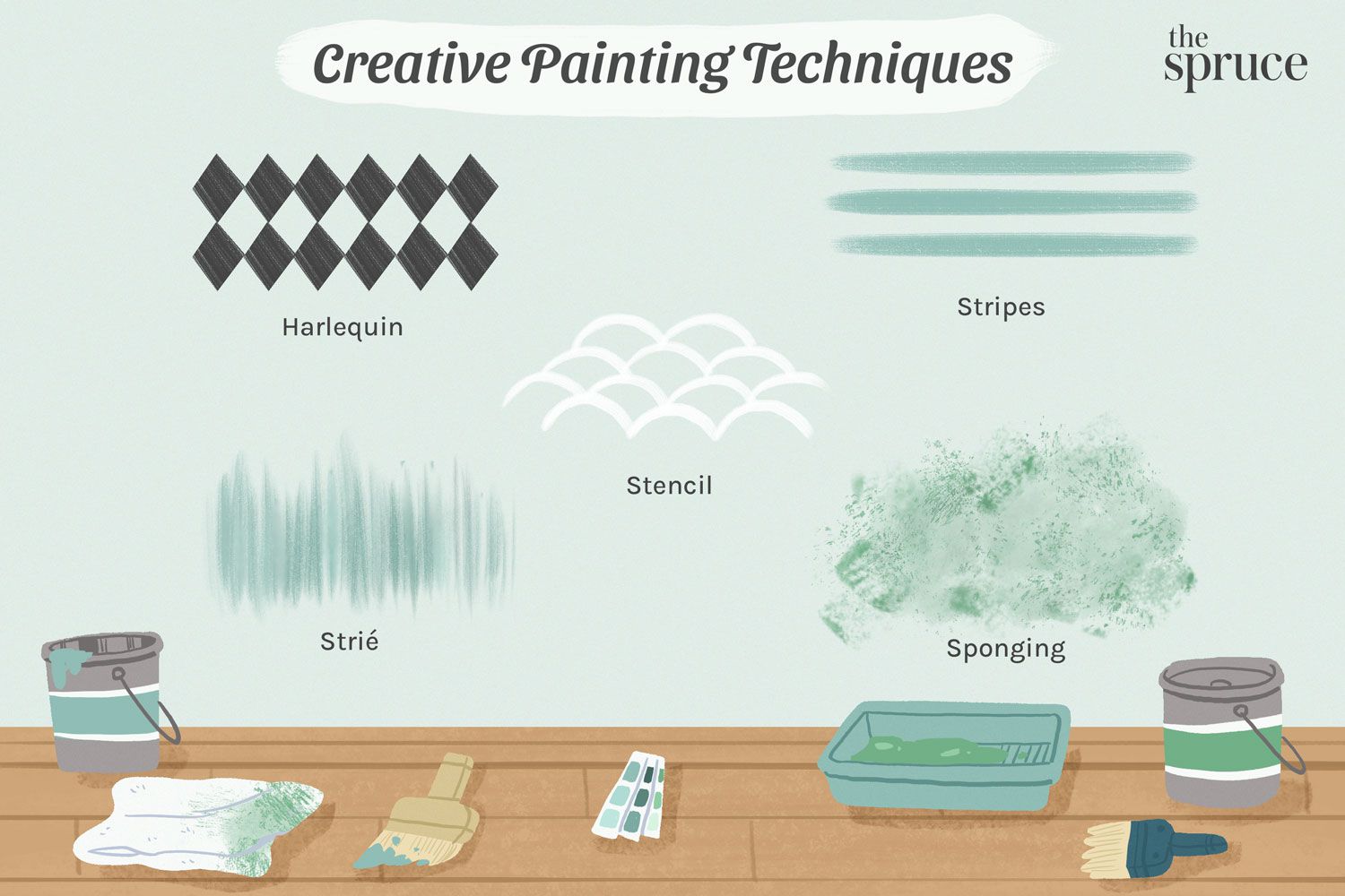
The 16 Decorative Wall Painting Techniques
1) Color Washing (Glaze + Soft Movement)
The look: a gently mottled, old-world finishlike the wall has history (but not the kind with suspicious stains).
Color washing layers a translucent glaze over a base color so undertones peek through.
Best for: dining rooms, hallways, bedrooms, Mediterranean or vintage styles, and walls that need visual warmth.
How to do it: Paint a base coat and let it cure. Mix a glaze with your top color, then brush or sponge it on in loose,
overlapping strokes. Soften edges with a damp rag or sponge to keep it cloud-like rather than blotchy.
Pro tip: Keep a “clean-up” rag slightly damp (not wet) to lift glaze and control contrast.
2) Sponging (Dab, Lift, Repeat)
The look: a textured, layered surface with a soft, organic pattern. Sponging can feel subtle and beachyor bold and artsydepending on contrast.
Best for: accent walls, powder rooms, and spaces where you want texture without heavy plaster.
How to do it: Start with a dry base coat. Load a sea sponge lightly, dab excess paint off on a tray or paper,
then press and twist randomly on the wall. Rotate the sponge often so it doesn’t “stamp” the same shape.
Pro tip: Light pressure builds depth. Heavy pressure builds… regret.
3) Rag Rolling (Instant Character, Country-Chic to Modern)
The look: a soft, marbled texture created by rolling or twisting a rag through wet glaze.
It’s a classic faux finish that still works when colors are modern and contrast is controlled.
Best for: living rooms, bedrooms, and large walls where you want movement without a busy pattern.
How to do it: Apply a base coat. Mix a glaze tinted with your top color. Twist a rag into a loose rope,
then roll it over the wet glaze. Work in 2–3 foot sections and keep a wet edge so the pattern stays seamless.
Pro tip: Tape corners and trim carefullyragging loves to “gift” extra glaze into edges.
4) Stippling (Tap-Tap Texture)
The look: a dotted, tactile surface made by dabbing with a stippling brush or sponge.
It can mimic suede, stone, or antique finishes depending on color and glaze.
Best for: accent walls and ceilings where subtle texture looks rich (especially with side lighting).
How to do it: Brush or roll on a glaze coat, then “pounce” with a stippling brush in a random pattern.
Avoid obvious rowsthis is not the time to become obsessed with perfect spacing.
Pro tip: Step back every few minutes. Up close, everything looks like “dots.” From 6 feet away, it looks like design.
5) Strié (Dragged Stripes That Whisper “French Farmhouse”)
The look: fine, vertical (or horizontal) lines that mimic aged brushwork.
Think elegant, slightly weathered, and quietly expensive.
Best for: paneling, trim, cabinets, and feature walls where you want subtle linear texture.
How to do it: Roll on a tinted glaze coat, then drag a long brush or wallpaper brush through it in one direction.
You can soften with a second dry brush for a more blended finish.
Pro tip: Keep your dragging tool cleanglaze buildup causes skips and clumps.
6) Ombre / Gradient Wall (Blend Like a Sunset)
The look: color that fades from dark to light (or shifts between hues). It’s playful, modern, and surprisingly calming when done in soft tones.
Best for: nurseries, bedrooms, creative studios, and stairwells (a vertical gradient looks amazing there).
How to do it: Choose 3–6 related colors. Mark transition bands lightly. Paint each band, then blend borders while paint is wet
using a dry brush or a slightly damp roller. Mixing intermediate shades in trays makes transitions smoother.
Pro tip: Work fast and keep edges wetombre is part art, part cardio.
7) Color Blocking (Big Shapes, Big Impact)
The look: bold sections of different colorsarches, rectangles, half-walls, frames behind a bed, or “painted headboards.”
It’s like modern art you can clean with a damp cloth.
Best for: rentals (paint is reversible), kid rooms, entryways, and any spot that needs a focal point.
How to do it: Measure and sketch your shapes. Use painter’s tape for crisp lines.
Paint the lighter color first, let it dry, then tape and paint the darker color (or vice versa depending on coverage).
Pro tip: A level is your friend. Your eyes will catch a crooked “straight line” immediately.
8) Crisp Painted Stripes (The Power Suit of Wall Patterns)
The look: clean horizontal or vertical stripes that can be classic (thin pinstripes) or bold (wide cabana stripes).
Best for: playrooms, bathrooms, feature walls, and spaces that need structure or height/width illusions.
How to do it: Mark stripe placement with pencil and a level. Apply painter’s tape carefully and press edges firmly.
Paint lightly along tape edges first, then fill the stripe. Remove tape while paint is still slightly wet for the sharpest line.
Pro tip: Don’t glob paint against the tapethin coats reduce seepage.
9) Geometric Tape Patterns (Modern, Custom, Surprisingly Addictive)
The look: triangles, chevrons, angled blocks, or abstract shapes created with painter’s tape.
It reads graphic and designer-y, especially with two tones of the same color family.
Best for: accent walls, home offices, and spaces that need energy without a busy wallpaper print.
How to do it: Plan the pattern on paper, then map it on the wall with light pencil marks.
Tape the lines, seal tape edges with the base color (optional but helpful), then paint your accent color and peel tape promptly.
Pro tip: Photograph the layout before painting. If you take a break, your future self will thank you.
10) Stenciling (Pattern Without Wallpaper Commitment)
The look: repeated motifs or allover patternsanything from Moroccan to Art Deco to modern minimalist shapes.
Stenciling can be subtle (tone-on-tone) or statement-making.
Best for: feature walls, entryways, and backsplashes (with proper topcoat).
How to do it: Center your layout with a level line, secure the stencil, then apply paint with a foam pouncer or stencil brush.
Use very little paint (seriouslyless than you think). Reposition carefully using registration marks.
Pro tip: “Dry brush” loading prevents bleed. If paint is wet enough to squish under the stencil, it will.
11) Metallic Glaze or Metallic Technique Finish (Soft Shimmer, Not Disco Ball)
The look: pearl, champagne, gold, bronze, or silvery shimmer that changes with light.
Done right, it looks luxe and dimensionallike the wall is wearing jewelry.
Best for: dining rooms, powder rooms, niches, ceilings, and feature walls behind sconces.
How to do it: Start with a smooth base coat (imperfections show under metallics).
Apply metallic glaze or a metallic technique finish using a roller, brush, or glazing tool depending on the product.
Keep strokes consistent and work in small sections to avoid lap marks.
Pro tip: Metallics amplify textureprep and sanding are non-negotiable.
12) Limewash (Cloudy, Chalky, Old-World Movement)
The look: matte, mineral softness with natural tonal variation. Limewash gives walls “living” movementsubtle highs and lows of color.
Best for: cozy bedrooms, living rooms, fireplaces, and spaces where you want warmth without gloss.
How to do it: Prep matters: surfaces should be clean and suitable for mineral paint. Apply with a large brush in loose,
crossing strokes (often called crosshatching). Build with multiple coats for depth, letting each coat dry as directed.
Pro tip: Embrace intentional imperfection. Limewash is supposed to look hand-finished, not factory-flat.
13) Venetian Plaster (Polished, Stone-Like Depth)
The look: smooth, layered plaster with depth and a subtle sheen (or high polish if burnished).
It can read like marble, limestone, or softly glowing stone.
Best for: formal living rooms, entryways, accent walls, and anywhere you want “high-end hotel” vibes.
How to do it: Apply thin coats of plaster with a trowel at shallow angles, varying stroke direction.
After drying, apply a second coat with overlapping strokes. Burnish with fine sanding and/or a clean trowel for sheen,
and consider a protective topcoat or wax depending on the finish.
Pro tip: Smooth walls are essential. Venetian plaster highlights bumps the way sunlight highlights crumbs on a black shirt.
14) Faux Concrete (Industrial, Soft, Modern)
The look: a cement-like wall with mottled variationurban loft energy without actual cement dust in your cereal.
Best for: modern living spaces, offices, accent walls behind open shelving, and minimalist interiors.
How to do it: Use a base coat in a concrete-gray range. Apply a slightly darker glaze or thinned paint in crosshatch strokes
with a large brush or sponge. Feather edges, vary pressure, and layer for depth. Some DIY methods use multiple grays plus gentle blending.
Pro tip: Keep contrast moderate. Too much dark-on-light can read “camouflage wall,” which is… a choice.
15) Faux Marble (Veining for Drama)
The look: painted marble veining using layered whites and grays (or bolder colors for modern stone looks).
Classic, glamorous, and surprisingly doable with patience.
Best for: statement walls, niches, and areas where you want a luxe accent (especially bathrooms with good ventilation).
How to do it: Start with a light base. Layer soft mid-tones with sponges for cloudy depth.
Paint long, thin veins with a light gray, then soften them immediately with a dry brush or sponge.
Seal if needed for durability and easier cleaning.
Pro tip: Real marble veins wander. If yours look like lightning bolts from a comic book, soften and blur.
16) Chalkboard Paint (Functional + Fun)
The look: a writable matte wall for notes, calendars, doodles, menus, or kid artbasically a wall that helps your brain remember life.
Best for: kitchens, mudrooms, playrooms, home offices, and behind pantry doors.
How to do it: Prime when needed (especially on bare wood or patched areas). Stir paint thoroughly.
Apply with a dense foam roller in light, even coats and avoid over-rolling. Add coats as directed, then let it cure before writing.
Pro tip: Give it full cure time before your first masterpieceor your wall will keep “ghosting” like it’s haunted by grocery lists.
How to Choose the Right Technique
Match the technique to your wall’s personality
- Walls with flaws: try color washing, sponging, rag rolling, or limewashmovement distracts from minor imperfections.
- Super smooth walls: go bold with metallics, stripes, geometric tape designs, or Venetian plaster.
- High-traffic spaces: choose finishes that can be top-coated or are easy to touch up (color blocking, stripes, stencils).
Think about time and tolerance
If you want a weekend win, stripes, color blocking, geometric tape, and chalkboard paint are usually straightforward.
If you want a showpiece and don’t mind a learning curve, Venetian plaster and faux marble are your “advanced level” projects.
Common Mistakes (and How to Dodge Them)
1) Skipping the sample board
Decorative finishes change with lighting, sheen, and even the direction you apply strokes. A test board saves you from repainting the whole room
because you “didn’t realize the undertone was secretly green.”
2) Using too much paint on stencils and sponges
Heavy loading causes bleed, blobs, and repeating shapes. Decorative work usually builds depth with thin layers, not thick ones.
3) Not keeping a wet edge on blends
Ombre, color washing, and faux concrete rely on continuous blending. Plan your sections and keep tools ready so you’re not hunting for a sponge
while the wall dries and locks in hard lines.
4) Tape trouble
For stripes and color blocking, press tape edges firmly and paint in light coats. Peel tape at the right time (often while paint is still a bit wet)
for cleaner lines. Rushing the tape step is how you end up with “handmade charm” when you wanted “crisp modern.”
Real-World Experiences: What DIYers and Pros Learn After Painting Decorative Walls (500+ Words)
Decorative painting looks glamorous in a five-second before-and-after clip, but real rooms have real conditions: uneven drywall,
curious pets, surprise humidity, and that one corner that absolutely refuses to look the same as the rest of the wall.
The most consistent “experience-based” lesson is this: decorative finishes aren’t hard because they require rare talent;
they’re hard because they require repeatable decisions. When people struggle, it’s usually not the techniqueit’s the
lack of a system.
For example, first-timers often discover that contrast control is the difference between “designer texture” and “accidental camouflage.”
With sponging, rag rolling, and color washing, the temptation is to pick two colors that feel dramatic on a paint chip.
On a full wall, that drama can turn loud. Many successful DIYers end up choosing colors closer together than expectedlike two shades apart
on the same stripthen building depth with layering. The wall still has movement, but it doesn’t shout over your furniture.
Another common experience: tools matter more than people think. A cheap roller can shed fuzz into a metallic finish.
A stiff, low-quality brush can leave harsh marks in a glaze. A sea sponge creates a natural pattern; a blocky household sponge can repeat
like a stamp. People who “suddenly got better” at decorative painting often didn’t magically improve overnightthey switched tools,
worked smaller sections, and stopped overloading paint.
Working time is also a big reality check. Ombre and blended faux finishes feel calm until you realize you’re basically racing the clock.
Many painters learn to stage their setup like a cooking show: paint poured, brushes ready, rags dampened, step stool placed, music chosen
(optional, but highly recommended). The goal is to avoid interruptions while the wall is wet. People who plan “pause points” at corners or
trim lines report fewer visible seams and a more professional look.
Then there’s the surprise MVP: stepping back. Decorative paint can look messy up close because it’s made of tiny marks, dots,
and strokes. From across the room, it blends into a cohesive finish. Many DIYers talk about the moment they stopped hovering two inches from
the wall and started checking the whole surface from 6–10 feet away. That’s when they caught repeating patterns, heavy patches, or overly straight
veins in faux marbleand fixed them before everything dried.
Edges and transitions are another “experience teacher.” Corners, ceilings, and baseboards are where decorative techniques can pile up.
Rag rolling and glazing tend to deposit extra product in corners. People who tape carefully, cut in neatly, and blend edges as they go
end up with finishes that look intentional rather than accidentally thick. If someone says, “It looked great until the corners,” that’s usually why.
Finally, the most satisfying experience reported with decorative walls is the “custom factor.” A stenciled wall can mimic artisan tile.
A color-block arch can frame a bed like built-in architecture. Limewash can make a new build feel older and warmer.
And chalkboard paint can turn a chaotic kitchen into a command center (or at least a place to write “BUY MILK” where everyone can see it).
The practical takeaway is simple: choose one wall, commit to prep, test your colors, and treat the process like a series of small steps.
That’s how “I tried a paint technique” becomes “I made a room feature that looks like it came with the house.”
Wrap-Up: Your Walls, but Make Them Interesting
Decorative wall painting techniques let you add depth and style with tools you can actually hold in your hands.
If you’re new, start with color blocking, stripes, or stenciling. If you want texture with forgiveness, try sponging, rag rolling, or color washing.
And if you’re ready to level up, Venetian plaster, limewash, faux concrete, and faux marble deliver serious wow-factor.
Test first, prep well, and remember: paint is one of the few design decisions you can redo without calling a contractor and taking a long nap afterward.