Some years in design quietly rearrange the throw pillows. Then there was 2016, which kicked in the front door, painted the walls white, added brass somewhere shiny, and tossed a blush-pink pillow on the sofa just to prove it had range. If you were decorating, renovating, daydreaming over mood boards, or simply trying to understand why every stylish room suddenly looked both calmer and more dramatic, 2016 was a fascinating year.
The biggest design trends for 2016 did not move in one neat direction. That was the fun of it. Minimalism got softer. luxury got cozier. bold accents showed up in rooms that still wanted to feel livable. Homeowners and designers leaned into tactile materials, thoughtful color stories, handcrafted pieces, and rooms that looked less staged and more personal. In other words, 2016 wanted your home to feel edited, but not sterile; stylish, but not uptight.
Below is a deep dive into the 16 home design trends that defined 2016, why they mattered, and how they helped shape the interiors we still recognize today.
Why 2016 Was a Turning Point in Interior Design
What made 2016 stand out was the tension between restraint and personality. Crisp white walls and Scandinavian-inspired simplicity were still everywhere, but they were no longer the whole story. Designers layered in warmth through brass, velvet, woven textures, florals, artisan details, and moodier paint colors. It was as if the design world collectively decided that a beautiful room should be polished, yes, but it should also look like actual humans lived there and maybe even drank coffee on the sofa without filing a permit first.
That mix of clean structure and expressive detail gave us some of the most memorable home decor trends of 2016.
The 16 Design Trends That Defined 2016
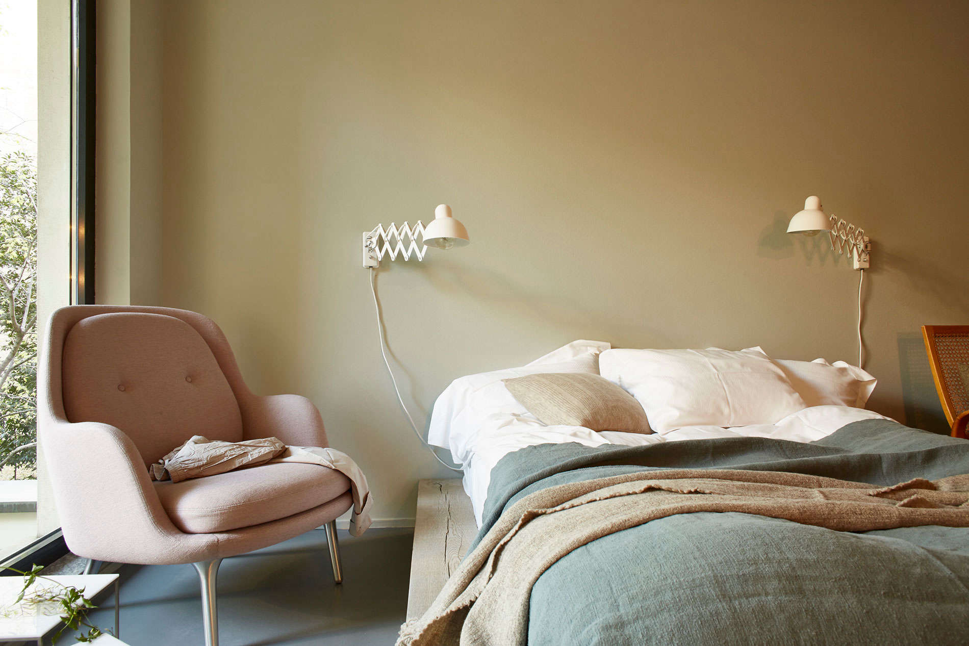
1. Millennial Pink Went Mainstream
If 2016 had an unofficial mascot, it was millennial pink. Soft, dusty, and suspiciously good at making everything look more expensive, this blush-toned shade moved far beyond nurseries and powder rooms. It appeared in textiles, wall colors, ceramics, art, and upholstery. The appeal was simple: it felt modern without being harsh and playful without being childish. It softened contemporary interiors and gave even minimal spaces a pulse.
2. Rose Quartz and Serenity Ruled the Color Conversation
Pantone’s choice of Rose Quartz and Serenity as the color duo of the year helped define the emotional mood of 2016 design. Together, the pale pink and soft blue combination felt calming, airy, and slightly dreamy. This palette showed up in bedrooms, accents, tableware, and decorative accessories. It nudged interiors away from aggressive statement colors and toward gentler, more comforting tones. Basically, 2016 looked at the chaos of the world and answered with a pastel exhale.
3. White Walls Became the Ultimate Blank Canvas
Clean white walls were one of the most visible design trends of 2016. They worked beautifully with Scandinavian minimalism, but they also supported bohemian rooms, industrial lofts, and more traditional homes. White walls made small rooms feel larger, let textures stand out, and gave homeowners permission to rotate styles without repainting every six months. When in doubt, people went white, and honestly, the walls rarely complained.
4. Simply White and the White-on-White Look Took Off
White was not just a default backdrop in 2016; it became a destination. Paint brands highlighted white as a design statement, and homeowners embraced white-on-white palettes that felt crisp, bright, and clean. Kitchens, trim, cabinetry, and ceilings all got in on the action. The effect was not boring when done right. It created a quiet stage for natural wood, dark accents, greenery, and mixed textures to do the interesting part of the performance.
5. Matte Black Fixtures Added Instant Edge
Matte black fixtures became one of the easiest ways to modernize a room in 2016. Faucets, light fixtures, hardware, and shower frames suddenly looked sharper, cleaner, and more architectural in black. The finish had a cool confidence that chrome could not quite match. It made kitchens and bathrooms feel more intentional, and it paired especially well with white tile, wood tones, and brass accents.
6. Brass Came Back With Better Manners
Brass returned in 2016, but this was not the loud, lacquered brass of earlier decades strutting into the room and demanding applause. This version was warmer, subtler, and much better behaved. Unlacquered or brushed brass showed up in mirrors, sconces, furniture legs, bar carts, and cabinet hardware. It added depth and warmth without screaming for attention, which is honestly the dream for most decorative finishes.
7. Marble and Brass Became a Glamorous Power Couple
Marble had already built a strong following, but in 2016 it became especially influential when paired with brass. The combo delivered instant luxury, whether it appeared in kitchens, side tables, lighting, trays, or bath accessories. White marble kept rooms feeling crisp, while brass prevented the look from turning too cold. Together, they created a polished, high-end feel that designers and homeowners could scale up or down depending on budget.
8. Velvet Turned Rooms Into Softer, Moodier Spaces
Velvet was one of 2016’s most memorable material trends. The fabric brought depth, softness, and a little bit of drama to everything it touched. Dining chairs, sofas, pillows, and even wall applications embraced velvet’s plush texture. In jewel tones, it felt rich and cinematic. In neutrals, it made quiet rooms feel more layered. It was one of those rare trends that managed to look glamorous and cozy at the same time, which is basically design wizardry.
9. Faux Fur Made Comfort Look Luxe
Alongside velvet, faux fur helped fuel the cozy-luxury mood of 2016. Throws, stools, pillows, and accent pieces gave rooms a winter-ready softness without making them look sloppy. This trend fit neatly into the era’s appetite for tactile interiors. Rooms were no longer only about clean lines and edited silhouettes; they were also about how a space felt. And in 2016, the answer was often, “soft enough that you suddenly want a nap.”
10. Geometric Wallpaper Brought Walls Back to Life
Wallpaper made a serious comeback in 2016, especially in geometric patterns. Instead of grandma’s floral dining room making an unexpected comeback tour, the standout looks leaned modern, graphic, and bold. Designers used wallpaper to create rhythm, depth, and focal points. Even a single accent wall could transform a room from “nice enough” to “oh, somebody here owns a mood board.”
11. Bold Black-and-White Decor Felt Graphic and Fresh
Black-and-white palettes were big in 2016, especially in rugs, art, textiles, and accessories. The contrast felt timeless, but the execution leaned fresh and playful rather than formal. Graphic prints, striped pillows, patterned floors, and sharply outlined furniture all fit the trend. It was a practical move too: black and white could anchor a room while leaving plenty of room for brass, blush, greenery, or wood to join the party.
12. Dark, Moody Paint Colors Started Winning People Over
2016 helped shift the conversation around dark interiors. Deep greens, charcoals, navies, and saturated dramatic shades began to feel glamorous rather than gloomy. Designers showed that dark walls could make a room feel intimate, layered, and sophisticated, especially when balanced with metallic accents and lighter ceilings or trim. It was one of the year’s clearest signals that homeowners were ready to take design risks beyond yet another agreeable beige.
13. Handmade and Artisan-Sourced Decor Became More Desirable
Mass-market pieces still had their place, but 2016 saw a stronger appreciation for handcrafted decor and small-batch design. Hand-printed textiles, studio ceramics, woven wall hangings, metalwork, and maker-driven furnishings gave interiors more character. This shift reflected a broader desire for homes to feel personal instead of copy-pasted. A room looked better when it had at least one piece that suggested a human being, somewhere, made it with actual hands and probably strong opinions.
14. Natural Materials and Locally Sourced Wood Gained Attention
Designers in 2016 increasingly talked about sustainability, natural finishes, and locally sourced timber. Wood was appreciated not just as a structural material but as a visual anchor that added warmth, texture, and authenticity. Natural grain, imperfect finishes, and less processed surfaces all contributed to spaces that felt grounded. This trend also pointed toward a growing desire to reduce waste and create interiors with longer-lasting value.
15. Soft Florals and Nature-Inspired Motifs Returned
Florals in 2016 were less about fussy traditional prints and more about large-scale, runway-inspired softness. Nature began showing up in wallpapers, drapery, accessories, and artwork in a way that felt romantic but still fresh. The same impulse supported greenery, botanical accents, and other organic references. Homes were becoming less rigid and more emotionally inviting, which is a very elegant way of saying people were tired of rooms that looked like nobody was allowed to sit in them.
16. Personalized, Functional Spaces Mattered More Than Ever
One of the most important design trends of 2016 was not a color or material at all. It was the idea that homes should reflect the people living in them. Personalized cabinetry, refreshed furniture facades, practical storage, collected accessories, and curated objects all pointed to a more individual approach. Minimalism was still influential, but by 2016 it had begun to loosen its tie. Homes were expected to be useful, expressive, and tailored to real life.
What These 2016 Trends Still Tell Us Today
Looking back, many of the top interior design trends of 2016 were not fleeting at all. White walls never really left. Matte black became a long-term hardware favorite. Brass survived the trend cycle. Velvet keeps returning. Handmade decor has only become more valued. Even the soft color psychology behind Rose Quartz and Serenity still shows up in today’s appetite for comforting, livable spaces.
The bigger lesson is that 2016 helped bridge two design eras. It took the cleaner, quieter instincts of early-2010s minimalism and mixed them with texture, warmth, and personality. It gave us homes that looked curated rather than cold. And that balance still feels relevant.
Experiences and Memories of Living Through 2016 Design Trends
What I remember most about 2016 design is how ordinary people started talking about interiors like they were style editors. You did not need a design degree or a sprawling custom home to participate. You just needed a white wall, a brass lamp, a blush pillow, and the confidence to say, “Yes, this tiny tray is marble, and yes, it is apparently important.” Design stopped feeling like something reserved for glossy magazines and started feeling like a language homeowners could actually use.
There was also a genuine shift in how rooms were supposed to feel. Earlier minimalist spaces often looked impressive but a little emotionally unavailable, like they would judge you for setting down a mug without a coaster. In 2016, interiors got softer. Faux fur throws, velvet cushions, woven textures, and gentle color palettes made rooms feel more human. Even dramatic spaces had comfort built into them. A navy wall no longer meant formality; it meant mood. A white room no longer meant emptiness; it meant possibility.
Another memorable part of 2016 was how much experimentation felt allowed. People mixed boho pieces with Scandinavian furniture, layered industrial fixtures into classic homes, and paired clean architecture with handmade objects. There was less pressure to belong to one rigid style tribe. If your room had a modern sofa, a vintage side table, a brass sconce, and a ceramic vase from a weekend market, that did not read as confused. It read as interesting. That freedom was exciting.
The color story of the year also had a strangely calming effect. Rose Quartz and Serenity were easy to tease because, yes, the names sounded like a spa menu written by a very relaxed cloud. But the popularity of those shades made sense. They were soft, hopeful, and easy to live with. Combined with white paint and natural wood, they helped create rooms that felt lighter and less aggressive. In a noisy world, many people wanted their homes to feel like a quiet exhale.
I also think 2016 changed how people shopped for their homes. Instead of buying only matching furniture sets, more homeowners looked for character. They wanted artisan pieces, objects with texture, and details that felt discovered rather than mass-issued. That may sound dramatic, but it mattered. A room with even one handmade object suddenly felt less temporary. It felt lived in, thoughtful, and more personal.
Most of all, 2016 design felt optimistic. Not perfect, not always subtle, and occasionally one brass pineapple away from doing too much, but optimistic. It suggested that a home could be beautiful without becoming stiff, stylish without becoming soulless, and practical without becoming boring. That is probably why so many trends from that year still echo today. They were not just about what looked good in a photo. They were about creating spaces people actually wanted to come home to.
Conclusion
The best design trends for 2016 were not about following one strict formula. They were about balance: soft colors with sharp contrast, clean spaces with tactile materials, minimal backdrops with expressive details. From millennial pink and matte black fixtures to artisan decor and moody walls, 2016 proved that great design does not need to choose between comfort and style. The smartest rooms of the year managed to deliver both, and that is exactly why so many of these trends still feel surprisingly fresh.