Orange is the friend who shows up to brunch wearing sunglasses indoors and still somehow pulls it off.
It’s warm, energetic, and attention-grabbingso pairing it with the right colors can feel like trying to
style a diva. The good news: orange is way more flexible than people give it credit for.
Whether you’re decorating a living room, building a brand palette, or figuring out what to wear with a
burnt-orange sweater you bought during your “I’m basically an autumn forest” phase, there’s a combo that works.
This guide breaks down the best colors that go with orange (from calm neutrals to bold, designer-approved contrasts),
plus practical tips on undertones, balance, and real-life examplesso you don’t end up with a space (or outfit)
that looks like a traffic cone arguing with a highlighter.
How to Pair Orange Without Regretting It Later
1) Start with the orange you actually have
Orange isn’t one colorit’s a whole mood range. Peach and apricot read soft and airy. Tangerine is playful and loud.
Burnt orange and rust feel grounded and sophisticated. The brighter the orange, the more it benefits from “calming”
partners (neutrals, deep blues, charcoal). The earthier the orange, the more it loves natural materials and greens.
2) Use the color wheel, but don’t worship it
On the color wheel, orange’s complementary opposite is bluemeaning orange and blue create a high-contrast pairing
that feels vibrant and balanced. If that sounds too bold, lean into near-neutrals (cream, greige, warm gray) or
analogous neighbors (reds, pinks, yellows). For a modern, curated look, add a metallic as your “finishing jewelry.”
3) Balance with a simple ratio
If orange is the star, it doesn’t need to be the whole cast. A reliable interior-design trick is a proportion rule:
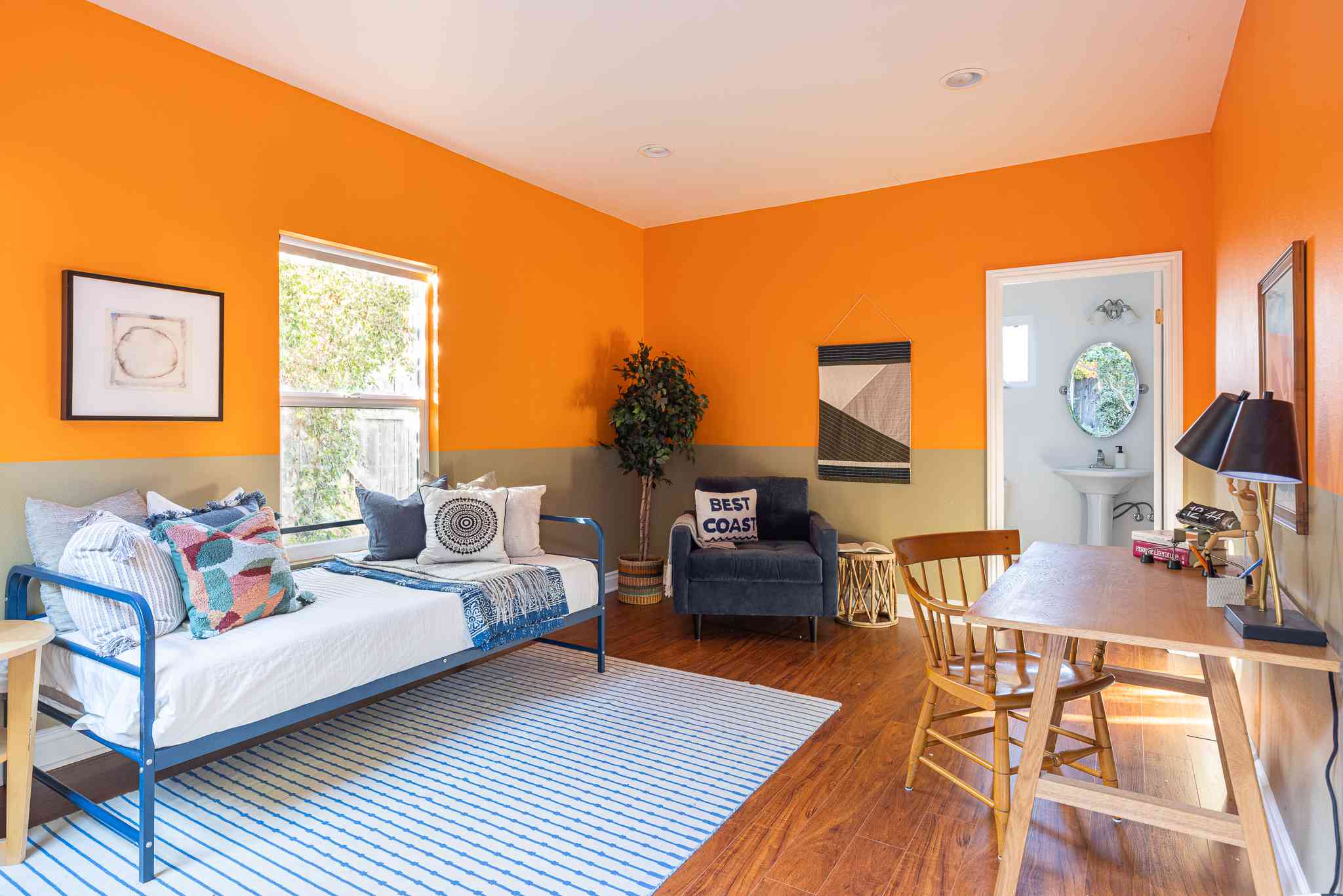
make one color dominant, one supporting, and one accent. In real terms: orange pillows (10–15%) against a neutral room,
or an orange accent wall balanced by calmer surrounding colors. Your eyes should feel “excited,” not “alarmed.”
The 30 Best Colors That Go With Orange
Below are 30 color pairings that work especially well with orange in interiors, outfits, and design palettes.
Each one includes a quick “why it works” and a real-world example you can actually use.
-
White
White gives orange room to breathe. It makes orange feel crisp, modern, and intentional instead of overwhelming.
Example: white walls + burnt orange sofa + black picture frames for a clean, gallery-style living room. -
Cream
Cream softens orange with warmth (like white’s cozier cousin). Perfect for rust, terracotta, and pumpkin tones.
Example: cream bedding + orange throw blanket + walnut nightstand = instant autumn calm. -
Ivory
Ivory reads slightly richer than bright white, which helps orange look elevated and less “sports team.”
Example: ivory curtains + orange accent chair + brass lamp for a softly luxe vibe. -
Beige
Beige is a natural partner for orange because both feel warm and grounded. This combo leans relaxed, not flashy.
Example: beige walls + orange art + woven textures (jute rug, rattan) for a sunbaked, casual look. -
Tan
Tan adds a “desert palette” feelespecially good with earthy oranges (rust, clay, terracotta).
Example: tan leather sofa + orange pillows + matte black accents = warm, modern, and not too sweet. -
Camel
Camel is fashion’s cheat code with orange. It’s warm, polished, and makes orange look expensive.
Example: camel coat + bright orange knit + denim = bold but totally wearable. -
Warm Gray
Warm gray tones down orange without making it feel icy. Great for modern interiors and subtle color schemes.
Example: warm gray walls + orange lower cabinets or bar stools for a sleek, contemporary kitchen. -
Cool Gray
Cool gray makes orange pop harder and feel more graphic. This is a “clean contrast” pairing.
Example: cool gray couch + orange throw + white rug: minimal base, energetic highlights. -
Charcoal
Charcoal adds drama and maturity. It’s especially good with bright orange that needs a grounding anchor.
Example: charcoal accent wall + orange artwork + warm wood = moody, modern, and not Halloween. -
Black
Black and orange is bold, graphic, and high-contrastuse it when you want orange to look sharp and modern.
Example: orange dress + black boots + minimal gold jewelry for a confident statement look. -
Navy Blue
Navy is one of the best colors with orange because it’s deep, classic, and balances orange’s heat.
Example: navy walls + burnt orange velvet chairs + cream trim for a rich, designer feel. -
Cobalt Blue
Cobalt is orange’s louder best friend. This combo feels energetic and youthful, especially in graphics and fashion.
Example: cobalt handbag + orange top + white jeans = bright, clean, and summer-ready. -
Cornflower Blue
A softer blue that still contrasts orange, cornflower feels airy and balancedgreat when orange is saturated.
Example: orange walls (or art) + cornflower curtains for a playful but softened pairing. -
Teal
Teal’s blue-green mix makes orange look vibrant without the harshness of pure blue. It reads bold but curated.
Example: teal sofa + orange pillows + brass side table = modern jewel-tone perfection. -
Turquoise
Turquoise adds a breezy, vacation feel. It pairs especially well with tangerine and bright orange.
Example: turquoise backsplash tiles + small orange accents for a cheerful, light-filled kitchen. -
Sky Blue
Sky blue cools orange down and makes it feel friendly and approachablegreat for casual spaces or spring palettes.
Example: orange throw pillows + sky blue wall + white trim for an upbeat, airy living room. -
Denim Blue
Denim blue is an easy, everyday pairingless intense than navy, more grounded than bright blues.
Example: orange sweater + light denim jeans + white sneakers = simple, flattering, done. -
Sage Green
Sage is muted, calming, and makes orange feel earthy instead of loud. Perfect with terracotta and rust.
Example: sage walls + burnt orange textiles + natural wood for a cozy, organic home vibe. -
Olive Green
Olive and orange reads sophisticatedlike a high-end fall palette that doesn’t try too hard.
Example: olive cabinetry + copper hardware + orange pottery for a warm, lived-in kitchen. -
Forest Green
Deep green adds richness and contrast, especially with brighter oranges. It feels classic and a bit dramatic.
Example: forest green velvet chair + orange throw blanket + cream rug. -
Emerald Green
Emerald with orange creates a jewel-tone lookbold, saturated, and perfect for statement rooms.
Example: emerald drapes + orange accent wall + gold frames for a glamorous, editorial feel. -
Mint
Mint is fresh and light, making orange feel playful rather than heavy. Great for springy palettes.
Example: mint dining chairs + orange centerpiece + white table setting. -
Blush Pink
Blush and orange can feel surprisingly modernwarm-on-warm but with enough contrast to stay interesting.
Example: blush wall paint + orange artwork + light wood furniture for a soft, contemporary look. -
Dusty Rose
Dusty rose makes orange feel grown-up. It’s less “candy” and more “cool vintage.”
Example: rust throw pillows + dusty rose rug + beige couch for a layered, cozy living room. -
Fuchsia
If you want bold, orange + fuchsia is the party. Best used in small doses or in fashion/graphics.
Example: orange blazer + fuchsia clutch + neutral outfit base (white/black) to keep it intentional. -
Lavender
Lavender cools orange down while keeping the palette playful. It’s an unexpected pairing that still works.
Example: lavender accent chair + orange art print + cream walls for a modern, creative space. -
Plum
Plum and orange feel rich and dramaticgreat for dining rooms, bedrooms, and evening spaces.
Example: plum curtains + burnt orange bedding + gold accents for a cozy, luxe bedroom. -
Burgundy
Burgundy adds depth and a slightly moody warmth, especially with burnt orange. Think “elevated fall.”
Example: burnt orange chair + burgundy rug + warm white walls for a layered, sophisticated room. -
Mustard Yellow
Orange + mustard is a warm-on-warm palette that feels vintage (in a good way). Use neutrals to separate them.
Example: mustard throw + orange pillows on a cream couch so the colors don’t blur together. -
Gold
Gold makes orange glow. It’s a natural match because both read warm and radiantperfect for glam accents.
Example: orange walls + gold mirror + white trim for a space that looks intentionally “designed.” -
Brass
Brass is gold’s slightly quieter siblingstill warm, but more vintage and grounded. Great with terracotta.
Example: terracotta planters + brass hardware + cream walls for a warm, timeless kitchen or entry. -
Copper
Copper leans reddish, so it harmonizes with orange beautifully. This pairing feels earthy, cozy, and textured.
Example: orange textiles + copper pendant lights + wood tones for an inviting, layered room.
Quick Orange Palettes You Can Steal (Interiors, Outfits, Branding)
- Modern Classic: burnt orange + navy + cream + brass
- Soft & Airy: peach + ivory + sage + light wood
- Bold & Graphic: bright orange + black + white (add a tiny hit of gold)
- Coastal Pop: tangerine + turquoise + white + sand beige
- Moody Luxe: rust + plum + charcoal + warm metallic
Common Mistakes (and the Easy Fixes)
Mistake: Using too much orange at once
Orange is powerful. If it’s everywhere, it can feel loud fast. Fix: keep orange to accents (pillows, art,
one statement chair) or limit it to one main surface and support it with calmer colors.
Mistake: Picking the wrong “neutral”
Some neutrals skew cool and can make certain oranges look harsh. Fix: pair bright oranges with warm whites
or softer grays; pair earthy oranges with creams, beige, and natural textures.
Mistake: Ignoring lighting and material
Orange changes a lot under different light bulbs and natural light. Velvet orange looks deeper; matte paint reads flatter.
Fix: test swatches in morning/day/night and pair orange with materials that match the vibe (linen for soft,
leather for grounded, metal for glam).
Final Takeaway
Orange is bold, but it’s not impossible. Pair it with crisp whites, cozy creams, and earthy neutrals for balance.
Use blues (especially navy and teal) for a classic complementary contrast. Bring in greens for an organic, grounded feel.
Add metallics for polish. And remember: orange doesn’t need to dominatesometimes it just needs to sparkle in the right places.
of Real-World Experience: What Actually Works with Orange
In real homes and real closets, orange tends to succeed when it’s treated like a “high-impact ingredient,” not the entire meal.
People who love orange often start with one confident piecea burnt orange sofa, an orange area rug, a set of tangerine dining chairs,
or even a bold orange front door. The win usually happens when they immediately give orange a calm supporting cast: cream walls,
a warm wood table, or a grounding deep tone like navy. The moment orange has something steady to lean on, it stops feeling loud
and starts feeling intentional.
One of the most common “aha” moments is realizing that orange doesn’t always need another bright color to look exciting.
A single orange accent against warm white can feel more modern (and more expensive) than orange paired with three other saturated hues.
In practice, a neutral-heavy room with one orange statement piece gets compliments because the eye knows exactly where to look.
It’s the same with outfits: an orange sweater with denim and a camel coat looks polished because there’s a clear hierarchy
orange is the pop, everything else is the frame.
Another consistent lesson: the shade of orange matters more than people expect. Bright, citrus oranges often feel best
with crisp neutrals, black, or clear blues (cobalt, turquoise) because those pairings keep the energy fresh. Earthy oranges (rust,
terracotta, burnt orange) usually look best with creamy whites, olive or sage greens, and natural textures like linen, leather,
cane, and warm woods. Many decorators find that rust-orange is almost “neutral-adjacent”it can blend in like a warm brown,
especially when paired with beige, tan, and brass.
Lighting is the sneaky villain in orange stories. An orange that looks like “cozy apricot” in a sunny showroom can turn “neon cheddar”
under cool LED bulbs at night. People who end up happiest with orange tend to test it in multiple lighting conditions and
pay attention to undertones: is the orange red-leaning (spicier) or yellow-leaning (brighter)? That little detail helps you pick
the best partner colorred-leaning orange loves deep greens and plums; yellow-leaning orange loves crisp blues and warm whites.
Finally, successful orange palettes often include one “bridge” element that ties everything together. In interiors, that might be
a rug that contains orange plus a little blue and cream, or artwork that repeats the palette so it feels cohesive. In branding,
it might be using orange as a call-to-action color while keeping most backgrounds neutral and typography dark. The pattern is the same:
orange shines brightest when it’s supported by balance, repetition, and just enough restraint to let it be the fun partwithout becoming
the stressful part.