Bathrooms had a big year in 2025. Suddenly, they weren’t just places to brush your teeth and wonder why one hand towel disappears faster than the other. They became “wellness retreats,” “spa sanctuaries,” and “design moments.” In theory, that sounded fabulous. In practice, some of those ideas aged about as well as a white bath mat in a house with children, hard water, or both.
That doesn’t mean 2025 was a design disaster. Not even close. A lot of the year’s bathroom trends pushed the room in a better direction: more texture, more personality, better lighting, smarter storage, and a stronger focus on comfort. But when trends move from tasteful inspiration to copy-and-paste obsession, regret usually shows up with a mop, a grout brush, and a renovation quote.
So which bathroom decorating trends made designers say, “Well, that was a fun little experiment,” and then quietly walk away? These are the five looks that felt exciting in 2025 but quickly proved fussy, flat, or downright exhausting to live with.
Why Bathroom Trends Burn Out So Fast
A bathroom has very little room to hide a bad decision. In a living room, an overly trendy lamp can blend into the background. In a bathroom, every finish is inches from your face, hit by moisture, steam, and bright light. If something is too glossy, too busy, too cold, or too impractical, you will notice. Daily.
That’s why bathroom design trends can go from “fresh” to “please make it stop” at record speed. The room is small, expensive to update, and full of hard-working surfaces. When a trend looks good only in a perfectly styled photo and not on an average Tuesday morning, designers start backing away from it fast.
In 2025, the biggest regrets didn’t come from boldness itself. They came from trends that were treated like universal solutions when they were really niche looks with a short runway.
1. Stark All-White and Black-and-White Bathrooms
Why designers tried it
For years, an all-white bathroom signaled cleanliness, simplicity, and expensive-hotel energy. Black-and-white versions added a sharper, more editorial vibe. In 2025, those palettes still had momentum because they photographed beautifully and felt easy to build around. A white vanity, white tile, white walls, black hardware, done. Clean. Crisp. Predictable.
Why designers regret it now
The problem is that crisp can turn clinical in a hurry. When every surface is white, the room stops feeling calm and starts feeling like it’s waiting for a dentist to walk in. And when the contrast is pushed too hard with black fixtures, black grout, black mirrors, and white everything else, the room can feel severe instead of soothing.
Designers have also grown tired of how flat these schemes can look in real life. White-on-white bathrooms often rely on subtle undertones, and those undertones love to fight. One tile reads cool. The vanity reads creamy. The tub reads bright white. Suddenly your “serene” bathroom looks like a paint swatch argument. Meanwhile, black-and-white combinations can feel more trendy than timeless once the initial drama wears off.
There’s also the maintenance issue. White surfaces show dirt, makeup smudges, rust spots, and every mysterious beige drip that appears near a sink and nobody wants to claim. Dark accents show soap residue, water spots, and fingerprints. It’s the rare decorating trend that makes both ends of the color spectrum work overtime.
What works better instead
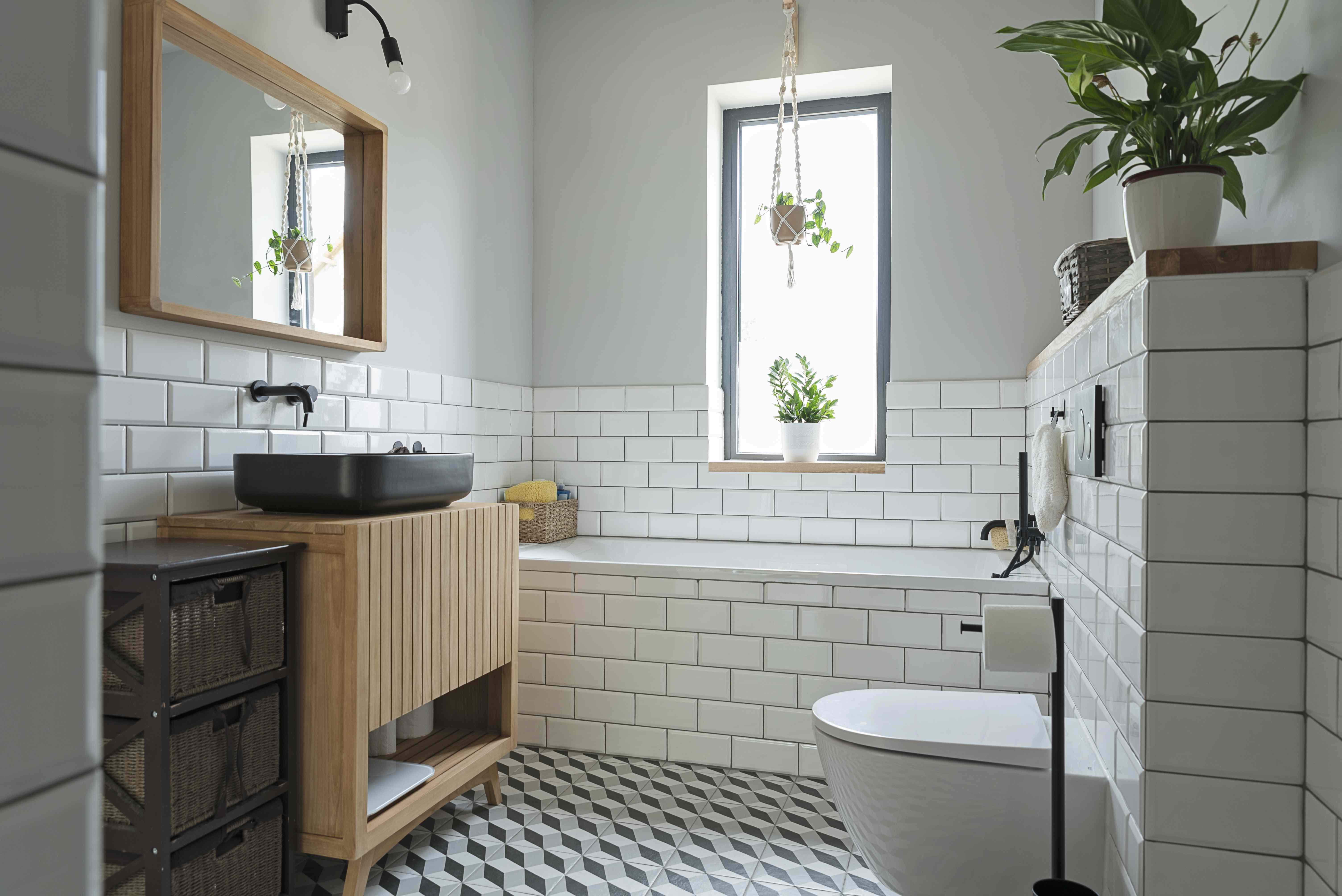
Designers are moving toward warmer, layered palettes that still feel clean without feeling chilly. Think soft plaster whites, mushroom, taupe, muted green, warm stone, walnut, brushed metals, and tonal variation. The modern luxury bathroom is less “laboratory with candles” and more “quiet boutique hotel where someone remembered texture exists.”
2. Ultra-Gloss Finishes and Fake-Luxury Marble Looks
Why designers tried it
In 2025, high shine had a moment. Glossy cabinetry, polished synthetic surfaces, acrylic wall panels, and oversized faux-marble tile promised big glamour for less money. On paper, the formula was irresistible: make the room gleam, add dramatic veining, and voilà, instant luxury.
Why designers regret it now
Because “instant luxury” can read suspiciously like “builder-grade trying very hard.” The issue wasn’t marble-inspired finishes in general. It was the overly shiny, obviously artificial versions with dramatic black veining, slick surfaces, and a lot of visual attitude but very little warmth. These rooms often ended up looking cold, impersonal, and slightly too eager to impress.
Gloss also magnifies everything. Bright vanity lights bounce off it. Steam settles on it. Water spots throw a little reunion on it. Smudges become part of the decor. And once an entire bathroom is wrapped in shiny material, the room can feel more like a showroom than a sanctuary.
Designers also realized that faux-luxe surfaces age quickly because they are so tied to a very specific trend cycle. The more engineered and uniform they look, the more disposable they feel. Bathrooms need materials that gain character from daily use, not finishes that look offended every time someone splashes water near them.
What works better instead
Today’s smarter move is a honed, matte, or lightly textured finish that adds depth without shouting. Realistic stone looks, tactile tile, limestone tones, zellige-inspired variation used sparingly, microcement, and warm natural surfaces all create a more grounded atmosphere. Luxury now looks quieter. It no longer needs to wink at you from across the room.
3. Wet Rooms Installed Just Because They Were Trendy
Why designers tried it
Wet rooms became one of the most talked-about bathroom ideas heading into 2025. The appeal was obvious: fewer barriers, more openness, a spa-like layout, and a sleek European feel. For large primary bathrooms, the look could be stunning. It also seemed like a clever way to make smaller spaces feel bigger, especially when the tub and shower shared one tiled zone.
Why designers regret it now
Because a wet room is not a magic trick. It is a highly specific layout that works beautifully only when the plumbing, drainage, ventilation, materials, and daily habits all line up. When they don’t, you get splash zones, damp floors, chilly mornings, and the thrilling possibility of your toilet living too close to your shower routine.
Some designers now admit the wet-room craze was oversold as a universal luxury solution. In reality, many homeowners wanted the look more than the lifestyle. They liked the seamless photos, but not the maintenance. Not the extra waterproofing. Not the constantly damp surfaces. Not the moment when a guest innocently asks where they’re supposed to put a dry towel.
And in smaller bathrooms, the “open” look sometimes backfired. Instead of feeling airy, the room felt exposed. Instead of streamlined, it felt like everything was always one splash away from chaos.
What works better instead
Designers still like wet rooms in the right home, but they’re using them more selectively. For most people, a well-designed walk-in shower, thoughtful glass partition, better storage, and layered materials deliver the same spa mood with fewer regrets. Translation: fewer puddles, same ambition.
4. Open Shelving That Turned Bathroom Products Into Permanent Clutter
Why designers tried it
Open shelving was supposed to make bathrooms feel lighter and more styled. Rolled towels, apothecary jars, a plant nobody remembered to water, maybe a candle that implied emotional balance. In 2025, it fit perfectly with the push toward curated, personal spaces. It also looked great in photos because it suggested a homeowner who owns exactly three beautiful products and never panic-buys extra toothpaste.
Why designers regret it now
Because real bathrooms are not prop closets. They contain sunscreen, cotton swabs, backup soap, cleaning products, hair tools, medications, half-used skin care experiments, and at least one item no one in the household admits belongs to them. Open shelving turns all of that into visual noise.
It also creates more surfaces to dust, more objects to edit, and more pressure to keep every bottle looking charming. Bathrooms already have enough jobs. They do not need to moonlight as retail displays.
Even designers who appreciate a little open storage are getting more cautious. The lesson from 2025 was that too much visible storage makes a bathroom feel busier, smaller, and less restful. That’s the opposite of what people wanted when they started chasing spa-like bathroom decor in the first place.
What works better instead
Closed storage is back in a big way, and honestly, it deserves applause. A bathroom feels calmer when the functional chaos is hidden behind attractive cabinetry. Open shelving still has a role, but it works best in tiny doses: one ledge, one niche, one thoughtfully styled shelf, not a full wall of exposed products pretending they’re art.
5. Statement Tile Overload
Why designers tried it
Tile was one of the stars of bathroom design in 2025. Designers and editors loved handcrafted looks, texture, rich color, movement, checkerboard patterns, micro-patterns, and creative layouts. That energy led a lot of homeowners to think more tile automatically meant more style. So they layered it on: dramatic floor tile, bold shower tile, patterned niche tile, contrasting grout, maybe a backsplash that wanted its own publicist.
Why designers regret it now
Because once every surface is making a statement, no statement is left. The room starts to feel crowded, and smaller bathrooms suffer the most. Instead of feeling collected and expressive, the space can feel restless. There’s nowhere for your eye to land, and nowhere for the room to breathe.
Some specific tile choices burned out especially fast. Overly glossy faux-marble tile, sharp chevron layouts, overly literal faux-wood tile, busy mosaics, and awkward mixes of slightly different white tiles all started to read more dated than daring. A trend that feels fresh in one installation often feels tired by the tenth copied version.
Another problem? Tile is not throw-pillow-level commitment. Once a trendy pattern is installed, you are living with it for years. Designers saw a lot of 2025 bathrooms where the tile was selected for impact first and longevity second. That’s usually how regret enters the chat.
What works better instead
Statement tile still works when it is edited. One strong move is enough. Maybe it’s a beautiful floor, a shower wall with subtle variation, or a handmade tile niche with character. The difference is restraint. The best bathroom decor trends now use tile to support the room, not overpower it.
What Designers Are Choosing Instead
After all the 2025 experimentation, the direction is becoming much clearer. Designers are not asking bathrooms to be boring. They’re asking them to be believable.
The bathroom decorating ideas winning now are warmer, quieter, and more personal: tactile surfaces, layered lighting, honest materials, better storage, richer but softer color, and details that feel collected instead of copied. Homeowners still want the room to feel elevated, but not in a way that demands constant polishing or a content creator’s level of discipline.
In other words, the future of bathroom style looks less like a trend board and more like a room you actually want to use every day. Revolutionary, I know.
Real-World Experiences Designers Kept Seeing in 2025
The most revealing thing about 2025’s bathroom decorating regrets is that the complaints were rarely about first impressions. On day one, many of these rooms looked fantastic. The tile sparkled. The shelves were beautifully styled. The black-and-white contrast felt sharp. The wet room looked like it belonged in a boutique resort with cucumber water in the lobby. Then real life arrived wearing wet socks.
One of the most common experiences designers described was the “photo versus routine” problem. A bathroom could look incredible in a reveal image and still feel annoying by week three. The glossy surfaces that made a space look bright also made every splash, fingerprint, and toothpaste fleck visible from outer space. Homeowners who wanted a serene room ended up spending more time wiping it down than enjoying it. A bathroom should support your routine, not assign you extra chores before coffee.
Another repeated experience involved storage optimism. People genuinely believed they could live with open shelving because they loved the airy look. But bathrooms are where good intentions go to die under a pile of cotton rounds, backup shampoo, prescription bottles, and a hair dryer cord that has somehow learned emotional warfare. Designers noticed that homeowners often styled their shelves beautifully at the start, then slowly filled them with everything they didn’t want on the counter. What began as a curated display became a visual confession.
Color was another lesson. Stark white bathrooms often felt fresh at first, especially when paired with bright lighting and clean lines. But over time, many homeowners found them cold, flat, and a little joyless. Black-and-white versions had a similar arc: very dramatic in photos, less charming at 6:15 a.m. in February. Bathrooms are deeply sensory spaces. When the palette feels too harsh, the room stops being relaxing and starts feeling transactional, like it’s timing you.
Wet rooms produced a different kind of regret: not aesthetic disappointment, but logistical fatigue. The issue wasn’t that they looked bad. It was that they asked more of the room and the people using it. Homeowners learned that a layout designed for visual openness can become high-maintenance if drainage, ventilation, and spacing aren’t nearly perfect. Beautiful? Yes. Effortless? Not always. And that distinction matters when you’re using the room twice a day, every day, not just admiring it from a doorway.
Then there was tile overload, which may be the best example of trend enthusiasm outrunning restraint. Designers saw bathrooms where every single surface tried to be memorable. The floor had a pattern. The shower had another pattern. The niche had a third. The grout had opinions. The room wasn’t ugly, exactly; it was just exhausting. Homeowners eventually realized they didn’t want a bathroom that felt like it was performing. They wanted one that felt calm, useful, and quietly impressive.
The takeaway from all these experiences is refreshingly simple. The best bathroom trends in 2025 weren’t the loudest ones. They were the ideas that blended beauty with maintenance reality, function with comfort, and personality with restraint. That’s the version of bathroom design that survives trends, survives daily use, and survives the moment you notice guests are absolutely judging your hand soap. Politely, of course.
Final Thoughts
Bathroom trends are fun. Regret is not. The smartest designers in 2025 didn’t stop experimenting; they just stopped pretending every trendy idea was timeless. That shift matters.
If there’s one lesson from the year’s most regrettable bathroom decorating trends, it’s this: a beautiful bathroom should still feel good when the shelves are full, the mirror is foggy, the grout is real, and nobody has staged a eucalyptus branch anywhere. If a trend can survive normal life, it’s worth considering. If it only survives a photo shoot, let it go.