If HTML were a city, links would be the roads. Without them, your website is just a bunch of nice-looking buildings
with no streets, no addresses, and no way for visitors (or search engines) to get anywhere. The good news: creating a
link in HTML is wildly simple. The better news: doing it well (SEO-friendly, accessible, and secure) is still
pretty simpleyou just need a few smart habits.
In this guide, you’ll learn how to create an HTML hyperlink using the anchor tag (that’s the
<a> tag) in 9 clear steps. We’ll cover the must-know basics (like the
href attribute), plus real-world upgrades: linking to page sections, creating mailto
and tel links, opening links in a new tab safely, and writing link text that helps both humans and
Google/Bing understand what you mean.
Before the steps: What is an HTML link, really?
An HTML link (a.k.a. hyperlink) is usually an <a> element with an href attribute.
The href holds the destination (a URL), and the content inside the tag is what people click (your
anchor text).
That’s it. That’s the whole magic trick. Now let’s turn it into a professional-level tricklike pulling a rabbit out
of a hat and labeling the rabbit correctly for screen readers.
Step 1: Use the anchor tag (<a>)
The anchor tag is the standard way to create a clickable link in HTML. Think of it as the “make this clickable”
wrapper.
Basic structure
On its own, an <a> tag without href is like a door painted on a wall. It may look like
an entrance, but nobody’s going anywhere. So let’s give it a destination.
Step 2: Add the destination with href
The href attribute (Hypertext Reference) tells the browser where the link should go. It can point to a
web page, a file, a section on the page, an email address, and more.
Tip: Always include https:// for external sites
If you’re linking to another website, use the full URL. Otherwise, the browser may treat it like a relative path and
do something… creative. (Computers are literal. They do not “guess” politely.)
Step 3: Choose the right kind of URL (absolute vs. relative)
This step is where beginners accidentally create links that work on their laptop… and break everywhere else.
Choose the URL style that fits your situation.
Absolute URL (best for external links)
Relative URL (great for internal links)
Relative links point to pages within your own site without repeating the domain name. These are cleaner and easier
to maintain.
Common relative patterns
/path= root-relative (starts from your domain root)page.html= relative to the current folder../= go up one folder (use sparingly, like hot sauce)
For SEO and crawlability, straightforward <a href="..."> links are a safe betespecially for
internal linking that helps search engines discover your pages.
Step 4: Write anchor text that humans and search engines actually like
Anchor text is the clickable part of the link. It’s also one of the biggest missed opportunities in beginner HTML.
“Click here” tells users nothing and tells search engines even less. Use descriptive text that sets expectations.
Not great
Much better
Good anchor text improves usability, accessibility, and SEO. It helps readers scan faster, helps screen reader users
navigate more confidently, and helps Google/Bing understand what the linked page is about.
Anchor text mini-checklist
- Be specific: “Download the 2026 budget template” beats “Download.”
- Keep it concise: Don’t make the whole paragraph a link unless you enjoy chaos.
- Match intent: If it goes to a guide, say “guide.” If it’s a PDF, warn them (politely).
- Avoid URL-as-text: Humans don’t love reading long strings of slashes and question marks.
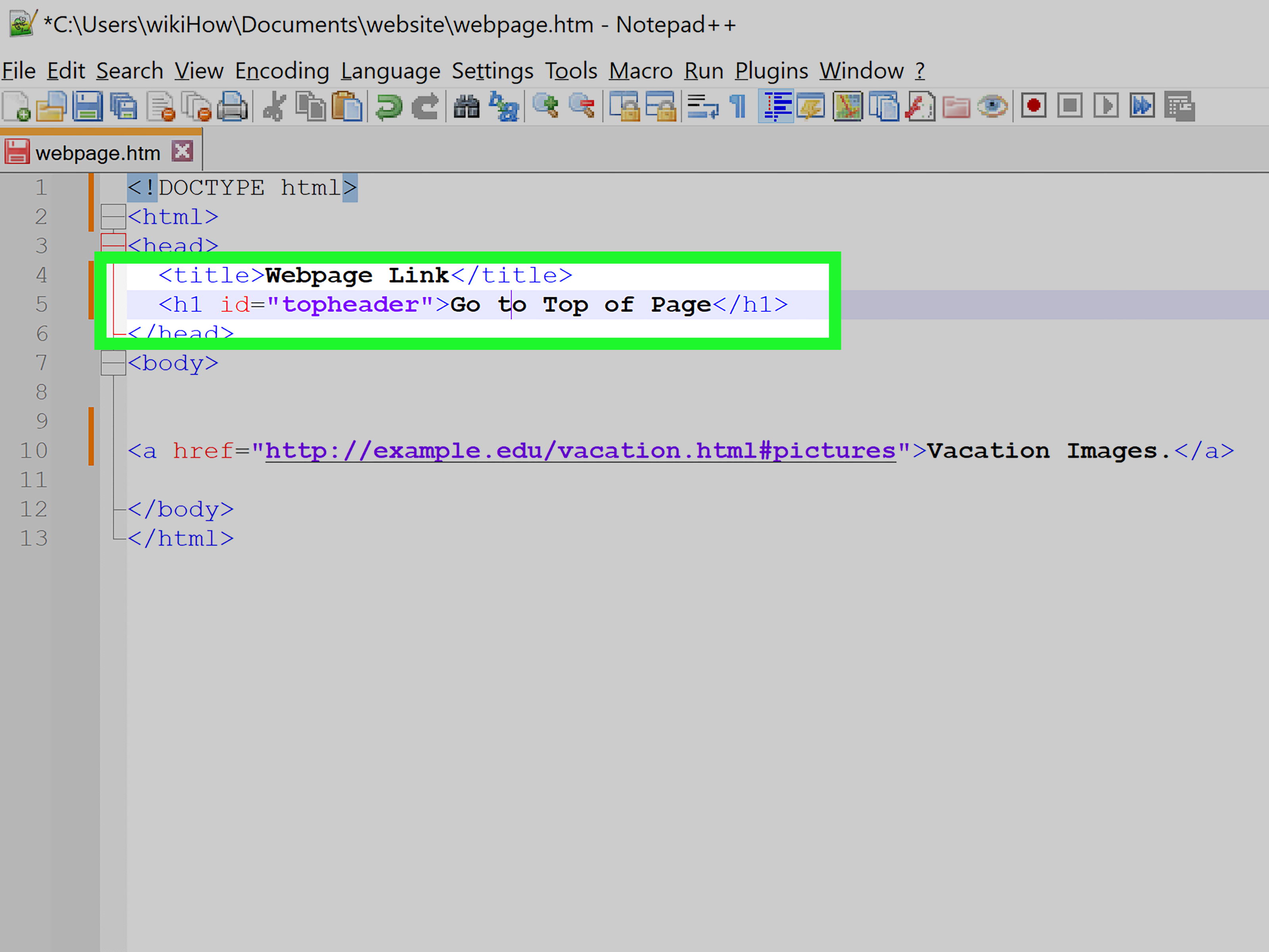
Step 5: Link to a specific section (jump links with IDs and fragments)
Want a link that jumps to a specific part of a pagelike a table of contents? Use a fragment
identifier (the part after #) that matches an element’s id.
Same-page jump link
Jump to a section on another page
Pro tip: IDs should be unique on the page. If you reuse the same id twice, browsers may jump to the
“first one they notice,” which is basically the web equivalent of shrugging.
Step 6: Open links in a new tab (and do it safely)
Sometimes you want external links to open in a new tab. That’s what target="_blank" does.
But here’s the important part: opening a new tab can introduce a security risk called reverse tabnabbing.
The fix is easyadd rel="noopener noreferrer" for external links you don’t fully control.
Safe new-tab link
In plain English: noopener helps prevent the newly opened page from messing with the page that opened it,
and noreferrer prevents referrer info from being sent in many cases. If you’re linking to an outside site,
this is a smart default.
Step 7: Add “power-up” link types (mailto, tel, download)
Links can do more than hop to another page. Here are three common “special links” that show up on real sites all the time.
1) Email links (mailto)
You can even prefill subject/body with query parameters. Just remember to URL-encode spaces and special characters.
2) Phone links (tel)
These are especially helpful on mobile. On desktop, behavior depends on the user’s apps (some open a calling program,
some do nothing, some just judge you silently).
3) Download links (download attribute)
The download attribute suggests downloading instead of navigating. Browsers can still make the final call,
especially across different origins and security settingsso treat it as a strong hint, not a pinky promise.
Step 8: Make your links accessible and easy to recognize
Links aren’t just for mouse users with perfect vision on a 27-inch monitor. People use keyboards, screen readers,
voice control, and small screens in bright sunlight (aka the “why is my phone a mirror?” scenario).
Accessibility essentials
- Use meaningful link text: avoid vague phrases like “more” or “click here.”
- Don’t rely on color alone: underlines are still the universal “this is clickable” signal.
- Keep focus visible: keyboard users should see where they are when tabbing through links.
- Label icon-only links: if the link is just an icon, add an accessible label.
Example: icon link with an accessible label
Bonus usability tip: consistent styling matters. If links look like normal text, people won’t click them. If everything
looks like a link, people won’t trust anything. The sweet spot is clear, consistent, and predictable.
Step 9: Test your link like you mean it
A link that “should work” is adorable. A link that does work is better.
Before publishing, do a quick quality check:
Quick link testing checklist
- Click it: yes, really. Try it on desktop and mobile if possible.
- Check spelling and protocol:
https://matters. One missing character can create a 404 party. - Test keyboard navigation: tab to the link, hit Enter, confirm it activates.
- Confirm new-tab behavior: if you used
target="_blank", make sure it’s intentional. - Watch for crawlability: links should be real
<a href>elements when you want search engines to follow them.
And for ongoing site health: periodically scan for broken links. The web changes constantly. Pages move, content gets
renamed, and sometimes a helpful resource vanishes into the digital mist like it owed someone money.
Common “gotchas” (so you don’t learn them the hard way)
Gotcha 1: Forgetting href
<a> without href isn’t a link. It might still be styled like one, but it won’t behave like one.
If you’re using an anchor tag as a button, consider using a real <button> instead.
Gotcha 2: Using “Click here” everywhere
If someone tabbed through your page and only heard link text out of context, would it still make sense?
“Click here” is the answer to a question nobody asked.
Gotcha 3: Opening everything in a new tab
New tabs aren’t always a gift. Use them when it helps (like external references), and consider telling users when something
opens a new tabespecially in accessibility-focused experiences.
Gotcha 4: External links without safe rel attributes
If you use target="_blank" for an external site, adding rel="noopener noreferrer" is a simple security upgrade.
It’s like wearing a seatbelt. Most days you won’t need it. That’s the point.
Conclusion
Creating a link in HTML is one of the first skills every web builder learnsand one of the skills that keeps paying rent.
When you combine the basics (<a href>) with smart extras (descriptive anchor text, jump links, safe new tabs,
and accessible labeling), your links become more than navigation. They become trust, clarity, and SEO signalall in a few characters.
If you remember only one thing, make it this: a good link doesn’t just take people somewhereit tells them where they’re
going before they click. Your users (and your rankings) will thank you.
Experience Section: of “Link Lessons” From the Real World
I once audited a site where every internal link said “Read more.” Every. Single. One. It was like walking into a library
where every book cover just says “BOOK.” Technically accurate. Practically useless. The funniest part? The site owner
was convinced their SEO problem was “Google being random.” No, friend. Google was being very logical: it couldn’t tell
which “Read more” went to pricing, which went to the blog, and which went to the return policy that everyone pretends
they read.
The fix wasn’t fancy. We kept the same pages, same design, same contentjust changed anchor text to match intent:
“Compare pricing tiers,” “See customer stories,” “Review the refund policy.” Within weeks, navigation got smoother,
support emails dropped (“Where do I find…?”), and search performance improved because internal linking finally had meaning.
That’s the sneaky power of good HTML links: tiny text changes can create massive clarity.
Another fun lesson: target="_blank" is not a personality trait. I worked with a brand that opened
everything in a new tabinternal pages included. Their logic was “We don’t want people to leave.”
What actually happened was browser tab explosion. Users would click three times and suddenly have seven tabs, lose track
of where they started, and bounce out of sheer annoyance. We switched internal links back to normal behavior and kept
new tabs only for truly external references. Engagement improved almost immediately. Sometimes usability wins are that simple.
Then there’s the “mailto saga.” A client wanted a prefilled email link with subject and body, which is doable, but you
quickly learn that email clients have opinions. Some handle long bodies gracefully; others get weird about spaces or
cut off text. The practical compromise: keep mailto links short (recipient + subject), and move longer context to a
contact form or a dedicated page. It’s less magical, but far more reliable. Users don’t care if it’s cleverthey care if it works.
My favorite link win is the humble jump link. For long pages (FAQs, documentation, policies), adding a table of contents
with fragment links (#section-id) is a quality-of-life upgrade that users notice instantly. It also encourages
deeper reading because people can jump to what they care about, then scroll naturally once they’re engaged.
Just make sure your IDs are unique, readable, and stablechanging IDs later breaks inbound links and bookmarks, which is
the internet’s version of moving someone’s front door while they’re still walking up the driveway.
If you’re building links while thinking about SEO, accessibility, and security, you’re already ahead of the game.
The “simple HTML programming” part is easy. The craft is making links that are clear, trustworthy, and helpful.
Do that consistently, and your site feels betterbecause it is better.