I didn’t set out to become a typographic gymnast. I just wanted to doodle a word that would behave itself
when I flipped the page. You know, like a well-trained golden retriever. Instead, my letters immediately
chose chaos. The “S” became a confused noodle, the “M” tried to turn into a “W,” and I started holding my
sketchbook up to a mirror like I was auditioning for a low-budget magic show.
And that’s when I remembered why ambigrams are so addictive: they’re a puzzle you can wear, print, brand,
tattoo (carefully), gift, or slap on a poster like, “Yes, I did just make typography do a backflip. Thank
you for noticing.”
Today I’m sharing ten ambigram concepts I madealong with the thought process behind each one. Since
ambigrams are visual by nature, I’ll describe how the letterforms “trade jobs” when rotated or mirrored,
plus the design moves that make them readable both ways. Think of this as a friendly behind-the-scenes
tour of the mind-bending word art you can build with patience, symmetry, and a willingness to erase the
same line seventeen times.
What Exactly Is an Ambigram?
An ambigram is a calligraphic or typographic design that can be read in more than one way
depending on how you view itrotated, reflected, flipped, or perceived as figure/ground. Some ambigrams
read as the same word in multiple orientations. Others reveal a different word when
turned or mirrored. In plain English: it’s wordplay you can physically spin. (Your neck may file a complaint.)
Common Ambigram Types (The “How Is This Even Legal?” Breakdown)
- Rotational (180°): Readable when turned upside down. The classic “flip it” ambigram.
- Mirror: Readable when reflected across a vertical or horizontal axis (like a lake reflection or mirror).
- Chain / Circular: Letterforms arranged in a loop so the word repeats around a circle.
- Figure–ground: One word appears in the positive space while another hides in the negative space.
- Perceptual shift: The same drawing “clicks” into different readings depending on how you focus.
Ambigrams have a long, delightful “wait, what?” history in design culture, from puzzle-like lettering art to
high-profile pop-culture appearances and branding. Two names you’ll see often are John Langdon
(known for ambigrams used with Dan Brown’s work) and Scott Kim (whose ambigram/inversion work
helped codify the form through books and long-running experimentation). There’s also a whole tradition of
typographic symmetry and visual word puzzles that makes ambigrams feel both modern and strangely timeless.
Why Ambigrams Hook Your Brain (And Your Brand)
Ambigrams do three things at once:
- They reward attention. The second reading feels like finding an Easter egg.
- They signal craft. Even non-designers can tell it took work (and by “work” I mean “wrestling with curves”).
- They carry meaning. Two readings can express duality: love/life, chaos/order, past/future, you/you-after-coffee.
That’s why ambigrams show up in logo design, wordmarks, tattoo concepts,
book covers, and poster art. They’re memorable, shareable, and just mysterious enough
to make people rotate their phones like they’re cracking a secret code.
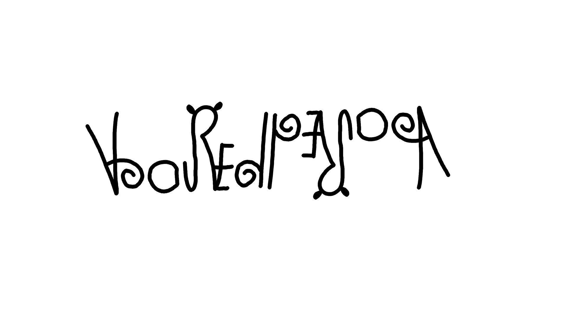
The Ten Ambigrams I Made (Concept Gallery + How They Work)
Quick note before we jump in: ambigrams are visual, so what I’m sharing here are designable concepts
with clear construction logic. If you want to turn any of these into a polished final piece, the workflow is:
sketch → flip/rotate test → refine → digitize → test again → refine again → pretend it was easy.
1) “SWIMS” (Rotational 180° the classic confidence builder)
This one is famous for a reason: it’s a friendly on-ramp to rotational ambigrams. The letter relationships do
most of the heavy lifting. The “S” can remain an “S” with a symmetrical style, “W” becomes “M,” “I” stays “I,”
and the last “S” behaves again. The trick is choosing a letter style where the curves don’t “tip” when inverted.
Design move: Use consistent stroke weight and make the terminals (ends of strokes) as neutral as possible.
Overly fancy serifs can betray the flip.
2) “NOON” (Rotational 180° symmetry with training wheels)
“NOON” is a symmetry playground. Depending on your letter style, the “N” can hint toward itself under rotation,
and “OO” is basically ambigram-friendly currency. The main challenge is making the “N” read as an “N” both ways
without turning into a weird “Z” mood.
Design move: Give the “N” slightly bowed diagonals and keep counters (interior spaces) open so it stays legible.
3) “MOM / WOW” (Rotational 180° a two-reading flip)
This is the ambigram equivalent of a party trick that still earns respect. “M” and “W” are natural rotation
buddies in many type styles. “O” stays “O.” So if you design “MOM” with a rotational plan, it can become “WOW”
when flipped (or vice versa).
Design move: Draw the middle “O” first. Then build mirrored side structures for the first/last letters so they
swap roles cleanly when rotated.
4) “UP / DOWN” (Perceptual shift + structure trick)
This one is more conceptual than literal. Instead of forcing every letter to become its opposite under rotation,
I designed it as a stacked lockup: “UP” on top, “DOWN” below, with shared stems and a central axis that
makes the composition feel “readable” both ways. When flipped, the viewer’s eye re-anchors on the opposite word
because the overall shape stays stable.
Design move: Use a strong central spine and repeat key shapes (like rounded bowls or pointed joins) to create a
visual rhythm that survives flipping.
5) “CHAOS / ORDER” (Figure–ground hiding a second word in negative space)
Figure–ground ambigrams are where ambigrams stop being “typography” and start being “optical illusion with receipts.”
Here, the primary readable word is “ORDER.” The negative space carved between letters (especially O/D/R) suggests
fragments that resolve into “CHAOS” when you reverse your attention and mentally “fill” the shapes.
Design move: Design the negative space on purpose. Treat it like ink. If you don’t, it will sabotage you quietly.
6) “LIFE / LOVE” (Rotational-ish meaning-driven letter morphs)
This concept leans into the emotional duality that makes ambigrams popular gifts and tattoo sketches. The letter mapping
usually needs stylization: the “F” can be softened into a shape that reads closer to “V” when flipped, and the “I” can
become part of a shared stroke. The goal is not perfect textbook typographyit’s a readable, believable transformation.
Design move: Start with chunky, simplified letterforms. Then add flourishes only after both readings work.
7) “CREATE / REACT” (Perceptual shift same letters, different reading order)
This is a word-nerd delight because both words share the same letters. Instead of rotating the design, I built an ambigram-like
effect through visual grouping: letterforms are connected so the eye naturally segments them as “CREATE,” but when
you shift focus (or follow a different implied baseline), the groupings resolve as “REACT.”
Design move: Use ligatures (connected strokes) to create multiple “break points” where the viewer can choose
a different path through the letters.
8) “YES / NO” (Mirror a clean, bold contrast piece)
A mirror ambigram doesn’t have to be the same word both ways. Here, the idea is a two-faced wordmark:
viewed normally you get “YES,” but reflected across a vertical axis (or designed as a bilateral symmetry piece) the
interior shapes resolve to “NO.” This works best with blocky, geometric lettering and generous counters.
Design move: Build a symmetrical container shape first (like a badge or capsule), then carve letters out of it.
Carving is often easier than drawing from scratch for mirror concepts.
9) “READ / IDEA” (Rotational 180° letter trading with shared strokes)
This one is my favorite kind of hard: the kind that’s hard but fair. The “R” can be stylized to flip into something “A-ish,”
and “D” can flip toward itself. The trick is creating shared vertical strokes so the same spine supports both readings.
Design move: Use one dominant vertical stem as the anchor. Everything else negotiates with that stem.
10) “NAME / ME” (Customizable template concept the “make it yours” slot)
I saved one slot for the most popular ambigram request on Earth: a name. The reality is that names vary wildly in ambigram
friendliness, but you can improve your odds by:
- Trying all-caps vs. lowercase
- Testing a condensed font style (fewer wide shapes to reconcile)
- Looking for rotation pairs (like M/W, N/U, b/q, p/d in certain styles)
- Keeping the first draft ugly on purpose (beauty comes later)
Design move: Build a “skeleton” ambigram (simple strokes) that reads both ways, then dress it up with style.
How to Make an Ambigram Without Losing Your Mind (Workflow That Actually Works)
Step 1: Pick words that want to cooperate
Shorter is usually easier, but not always. Words with symmetrical letters (O, I, H, X) or easy rotation pairs (M/W, N/U)
give you a head start. If your word is full of stubborn shapes, consider a badge-style design where the overall composition
does more of the work than each individual letter.
Step 2: Sketch with the flip built in
Don’t “finish” one direction and hope the other direction magically appears. Sketch, rotate the page (or the layer), and
sketch into the rotated version. You’re basically negotiating a peace treaty between two readings.
Step 3: Use digital tools to test symmetry fast
Vector tools make ambigrams less painful because you can rotate/reflect instantly, align to guides, and refine curves precisely.
A practical approach is to draw half, duplicate it, rotate 180°, and tweak until both readings become believable. Then merge
shapes, adjust kerning, and simplify.
Step 4: Optimize legibility before decoration
If it doesn’t read, it doesn’t work. Texture and fancy flourishes should be dessert, not dinner.
Start with clean strokes, consistent weight, and clear negative space. Once it reads both ways, you can add style.
Ambigrams in the Wild: Books, Logos, and “Wait, That’s an Ambigram?!” Moments
One reason ambigrams feel familiar is that you’ve probably seen them without realizing it. Ambigrams have been used for book
titles and word art collections, and they’ve shown up in pop cultureespecially where themes of symbols, symmetry, and codes
matter. John Langdon’s ambigrams became widely recognized through their association with Dan Brown’s work, including the famous
“Illuminati” commission for Angels & Demons. (That moment did for ambigrams what a catchy chorus does for a band:
suddenly everyone’s humming it.)
In publishing, ambigrams often serve as both artwork and messagelike a cover that literally asks you to “take a second look.”
Ambigram books also tend to include short essays or reflections because the medium practically begs you to think about perspective.
In branding, the best ambigram logos don’t just flipthey stick. They feel inevitable once you see them, like the design
was hiding in the letters all along. That “inevitable” feeling is the secret sauce: when an ambigram is successful, it looks
effortless… even if it absolutely was not.
Common Ambigram Mistakes (So You Can Skip My Pain)
- Over-stylizing early: If you add flourishes before it reads, you’re decorating a problem.
- Ignoring negative space: Bad counters make good letters look guilty.
- Kerning amnesia: Spacing that works one way may collapse the other way.
- Forcing impossible letters: Some transformations are heroic. Some are just lies with confidence.
- Not testing at small sizes: If it only reads at poster scale, it’s a poster, not a logo.
Wrap-Up: Why I’m Sharing These (And Why You Should Try One)
Ambigrams are a perfect blend of logic and play. They make you slow down, look again, and accept that “correct” can have more
than one direction. If you’re a designer, they’re a masterclass in structure. If you’re not a designer, they’re still a fun way
to experience typography as a puzzle instead of background noise.
If you want to try your own, start with a friendly word (“NOON,” “SWIMS,” “MOM/WOW”), keep your first drafts unapologetically
messy, and flip early and often. Ambigrams don’t reward perfectionthey reward persistence.
Extra : A Realistic, Behind-the-Scenes “Ambigram Experience”
Here’s what making ambigrams usually feels like for most people who try it (and yes, this is the part nobody puts on the
highlight reel).
First, there’s the confidence phase. You pick a word. You think, “How hard can it be?” You write it neatly, flip
the page, andboomyour beautiful word turns into something that looks like a confused insect. The letters that felt solid a
moment ago suddenly seem flimsy. The “E” becomes a broken chair. The “R” becomes a pirate hook. The “S” becomes… emotionally
unavailable.
Then comes the pattern-hunting phase. You start noticing which letters behave under rotation and reflection. You
develop a weird appreciation for “O” because it just minds its business. You start giving the letter “I” too much credit
because it’s basically a dependable stick. You also begin to understand that ambigrams aren’t about forcing letters to shapeshift
like movie monsters; they’re about suggestioncreating forms that can plausibly be read as two things without the viewer
feeling tricked.
Next is the draft explosion. You don’t make one sketchyou make ten, twenty, fifty. Your trash can fills up with
paper that looks like it lost a fight with a pencil sharpener. This is the part where patience matters. Most ambigrams don’t
“arrive” fully formed. They evolve through tiny compromises: a curve is slightly tightened so it can double as a different curve
upside down; a serif is removed because it betrays the flip; a stroke weight is made consistent because inconsistency screams
when rotated.
Then you hit the breakthrough moment. Usually it’s small and unglamorous. You rotate the page and suddenly two
letters line up in a way they never did before. You realize the “problem” letter can borrow a stroke from its neighbor. Or you
discover that a little negative space can do the job of an entire extra line. It’s not fireworksit’s a click. But that click is
the magic. It’s the moment your brain goes, “Oh. That could actually work.”
After that comes the cleanup phase, which is basically adulthood. You refine. You simplify. You test it small.
You test it upside down. You test it in a mirror. You show it to someone who has no idea what you’re doing and ask, “What does
this say?” Their answer is your truth serum. If they get it, you’re on track. If they squint and guess “SANDWICH,” you have work
to do.
And finally you reach the sharing phase, which is the happiest phasebecause ambigrams are meant to be seen.
The whole point is the second glance, the surprised smile, the “wait… rotate it again.” That tiny shared moment of discovery is
why I keep making them. Typography is usually static. Ambigrams let it dance.