If you love country-house interiors but don’t want your home to look like a themed gift shop exploded in it, selective color is your best friend. This approach keeps the bones of a room calmthink soft whites, warm neutrals, natural wood, stone, linen, and aged metalsthen adds color in deliberate, high-impact places. The result is cozy, collected, and full of personality without feeling busy.
In other words: your room can whisper timeless country charm and still wink with a saffron velvet pillow, a moody blue bench, or a sage-painted cabinet. That’s the magic. It’s not “more color.” It’s better-placed color.
This guide breaks down how to recreate the look in a practical, budget-flexible waywhether you’re styling a true country home, a suburban house, or a city apartment that dreams of muddy boots, fresh bread, and a dog asleep by the fireplace.
What “Selective Color” Means in Country House Design
Selective color is exactly what it sounds like: using color sparingly and intentionally instead of spreading it evenly across every surface. The foundation stays restrained, while accent color appears where it can do the most visual work.
In a country-house setting, that usually means:
- Neutral architectural backdrop: walls, trim, large upholstery, and flooring in cohesive tones.
- Texture doing the heavy lifting: linen, wool, wood grain, wicker, leather, matte paint, aged brass, iron.
- Color concentrated in moments: pillows, painted furniture, art, lampshades, a single cabinet run, a bench, or an accent wall.
- A lived-in mood: nothing too matchy-matchy, nothing too precious, and definitely nothing that screams “I bought every item on the same Saturday.”
This style works especially well in country-inspired interiors because rustic materials already provide visual richness. Exposed beams, wood floors, stone fireplaces, old baskets, and vintage pieces create depth even when the palette is restrained. Color then becomes a spotlight, not background noise.
Why It Works So Well in a Country House
1) Country interiors are naturally texture-rich
Country and farmhouse spaces tend to include woven baskets, painted woods, iron hardware, natural fibers, and weathered finishes. When texture is strong, you don’t need every object to be colorful. A room can feel warm and layered even with a mostly neutral palette.
2) Selective color protects the “calm” factor
Country houses are supposed to feel comfortable, not chaotic. A limited palette helps rooms feel restful and connected, especially in open-plan areas. It also prevents beloved vintage finds from competing with each other like contestants in a decorating reality show.
3) It makes your favorite pieces look expensive
A single deep blue velvet cushion on a pale linen sofa looks more intentional than ten random accent colors scattered everywhere. Strategic contrast creates focus. It also gives even affordable pieces a more curated look.
Start with the Foundation: Your Neutral Base Palette
The secret to selective color is that the neutral base cannot be an afterthought. If the foundation is muddy, too cold, or inconsistent, the accents will feel random instead of elegant.
Choose your “quiet” colors first
A strong country-house base usually includes:
- Warm white or soft off-white for walls/trim
- Greige, taupe, oat, stone, or pale mushroom as supporting neutrals
- Natural wood tones (light oak, medium brown, or dark stained wood)
- A grounding dark tone (black, charcoal, deep brown, or inky green) used sparingly
Think of this as your house’s “wardrobe basics.” White shirt, good jeans, tailored coat. Then your accents are the jewelry, scarf, or bold shoes.
Work with undertones, not against them
This is where many beautiful plans go to die. Two beiges can look nearly identical on a paint chip but clash wildly in a room because one leans pink and the other leans yellow. Before choosing paint, study your fixed elements: flooring, brick, tile, countertops, ceiling beams, and wood cabinets. If your wood skews orange or red, choose colors that complement rather than fight those undertones.
Pro tip: compare your paint sample next to a known “true” color (or a neutral reference card) and test it at different times of day. Morning light, afternoon light, and lamplight can make the same paint look like three different personalities.
Use light direction to your advantage
North-facing rooms often read cooler, so warm whites and warm neutrals tend to feel friendlier there. South-facing rooms have warmer light and can handle a wider range of shades. East- and west-facing rooms shift through the day, so balanced neutrals are often the safest choice if you want a consistent mood.
If a room is short on natural light, lighter hues and warmer tones usually help it feel brighter and more welcoming. And yes, sample boards are still worth it. They are less exciting than buying pillows, but they save you from repainting while muttering dramatic monologues.
How to Add Selective Color Without Overdoing It
1) Start with textiles (the easiest win)
If you’re trying this style for the first time, begin with soft furnishings. Pillows, throws, drapery trim, and rugs are low-risk and high-impact. In a country house, velvet, wool, washed linen, and faded cottons are especially effective because they add both color and texture.
Try a “two-accent-color” rule for textiles, such as:
- Saffron + dusty blue
- Sage + rust
- Berry red + olive
- Ink blue + ochre
Keep the large upholstery neutral, then repeat each accent color 2–3 times in small ways. That repetition creates cohesion without looking staged.
2) Paint one hardworking piece
Selective color shines when you paint a single architectural or furniture element instead of the whole room. Good candidates include:
- A kitchen island
- A pantry door
- Built-in shelves
- A window bench
- A fireplace surround
- Lower cabinets or wainscoting
This creates a focal point and gives the room depth. Deep green, smoky blue, charcoal, or earthy terracotta can all work beautifully against a neutral country backdrop.
3) Use black (or near-black) like eyeliner
Country-inspired rooms often benefit from a little contrast. Black metal lighting, picture frames, curtain rods, or a painted trim detail can sharpen a soft palette and keep it from drifting into “all oatmeal, all the time.”
The key is restraint. A few dark notes add definition; too many can make the room feel heavy.
4) Let nature-inspired color do the talking
Selective color looks most at home in country interiors when the hues feel borrowed from the outdoors: sage, moss, lichen, sky blue, slate, wheat, clay, marigold, berry, and weathered navy. These colors age well, layer well, and don’t usually feel trendy after six months.
A “Steal This Look” Formula You Can Actually Copy
Here’s a practical formula inspired by the country-house selective-color look:
The Base (about 60%)
- Warm white walls
- Natural wood flooring or wood furniture
- Neutral sofa in linen, cotton, or slipcovered fabric
- Cream or natural drapery
The Supporting Layer (about 30%)
- Woven baskets for storage
- Vintage or vintage-look lighting in black metal or brass
- Textured rug in jute, wool, or faded pattern
- One or two darker grounding pieces (side table, frame, stool, cabinet)
The Selective Color (about 10%)
- Velvet cushions in saffron, blue, or moss green
- A painted bench, shelf backing, or accent cabinet
- Small artwork with a repeating accent hue
- Ceramics, books, or lampshades that echo the same palette
This approach follows classic color-balance logic while still feeling relaxed. It also makes it easy to refresh by season: switch pillow covers and a throw, and suddenly your room looks “new” without requiring emotional recovery from a full repaint.
Room-by-Room Ideas for Selective Color in a Country House
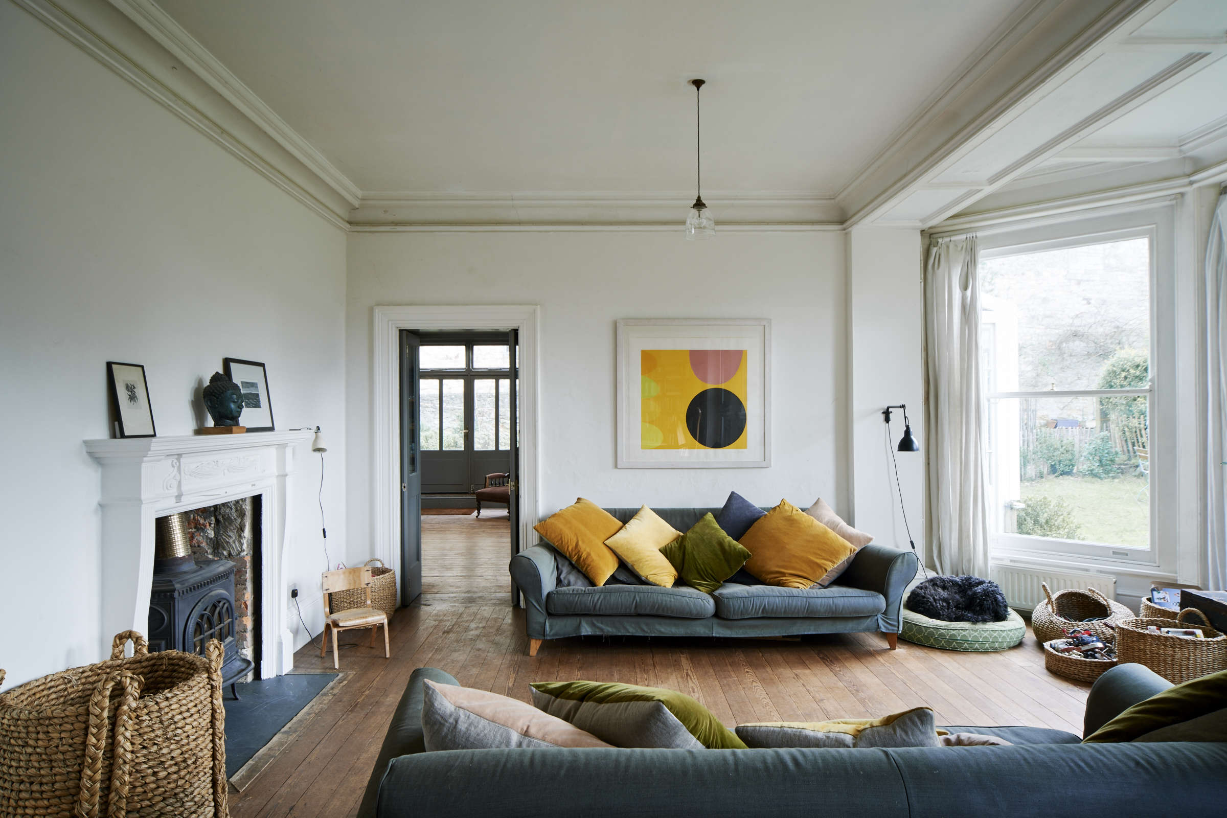
Living Room
Keep the walls and large seating quiet. Bring in color through layered pillows, a painted lamp base, art, and a single statement textile (like a patterned ottoman or vintage-style rug). Baskets in a bay window or beside the fireplace add storage and texture without adding visual clutter.
Kitchen
A country kitchen looks beautiful in a mostly neutral palette with one intentional popsage cabinets, a deep blue island, or warm yellow accents. Pair with open shelves, wood stools, and mixed metals for that collected-not-catalogued feel.
Bedroom
Use soft neutrals for walls and bedding, then bring in selective color through the headboard wall, quilt, curtains, or bedside lamps. Dusty blues, soft greens, and muted rose tones work especially well if you want a gentle, lived-in look.
Entryway or Mudroom
This is a great place to get bolder. Since the room is smaller and more functional, a deeper accent on built-ins, paneling, or a bench can add personality fast. It also makes the transition into neutral living spaces feel intentional.
Mistakes to Avoid
Using too many “star” colors
If everything is the accent, nothing is the accent. Pick one main color and one supporting color. That’s plenty.
Ignoring undertones
Warm white + cool gray + pink-beige + orange wood can get weird quickly. Test samples and compare them against your existing materials before committing.
Choosing accents that are all the same texture
A selective-color room needs texture variation. Mix velvet with linen, wood with metal, smooth ceramics with woven fibers. Texture is what keeps a neutral room soulful.
Painting before styling
Sometimes the room doesn’t need a new wall color at all. Try changing textiles and accessories first. Selective color often works best when the background stays simple.
How to Make It Feel Personal (Not Copy-Paste)
The best “steal this look” rooms are never exact copies. They’re translations. Keep the principles, then personalize the details:
- Use family pieces, flea-market finds, or handmade items.
- Choose colors connected to your surroundings (garden greens, local clay tones, coastal blues, mountain grays).
- Let function guide stylingblanket baskets, reading lamps, sturdy side tables, washable fabrics.
- Leave breathing room. A few meaningful objects beat a shelf crammed with decorative “stuff.”
That’s how a country house with selective color feels authentic: not perfectly arranged, but perfectly lived in.
Conclusion
“Steal This Look: A Country House with Selective Color” is really a lesson in restraint, rhythm, and charm. Build a warm neutral foundation, respect your room’s light and undertones, then add color in small but memorable momentsvelvet cushions, painted furniture, art, or a single accent wall. The payoff is a home that feels calm, layered, and full of character.
So yes, keep the white walls if you love them. Just give them better company.
Experience Notes: What Selective Color Feels Like in Real Life (Extended)
One of the most interesting things about living with selective color is that the room changes mood throughout the day without you changing a thing. In the morning, a country-style living room with warm white walls and pale linen curtains feels bright and almost minimal. The woven baskets, wood table, and iron lamp are noticeable, but quiet. Then the sunlight shifts, and suddenly the velvet cushions you barely noticed at breakfast start glowing. A saffron pillow looks richer. A dusty blue throw looks moodier. The same room feels warmer by late afternoon, almost like it’s settling in for the evening before you do.
That’s the part people don’t always expect: selective color creates a sense of movement. Because the color is concentrated in a few places, your eye travels to those moments naturally. You notice the painted bench, then the stack of books with similar tones, then the small piece of artwork tying it all together. The room feels layered, even if you didn’t fill every corner. It’s a very “country house” kind of beautycomfortable, practical, and quietly dramatic.
There’s also a psychological benefit. A neutral foundation tends to feel calmer and easier to live with long-term. You’re less likely to get tired of it. At the same time, the strategic pops of color stop the room from feeling sterile. This is especially helpful if you want a home that feels restful but not bland. In real life, that balance matters more than trendiness. A room can look amazing in a photo and still feel tiring every day. Selective color avoids that problem by keeping the visual energy focused.
Another real-world advantage is flexibility. If your taste changesor the season changesyou can refresh the entire mood without redoing the room. Swap rust and ochre textiles for sage and blue in spring. Bring in deeper plum or olive accents in fall. Replace one lamp shade, one pillow cover, and one piece of art, and the space feels updated. That kind of adaptability is perfect for people who love decorating but don’t want to commit to major renovations every time inspiration strikes at 11 p.m.
And maybe the best part: selective color makes everyday mess look more charming. A folded blanket on the sofa, a basket of magazines, a pair of boots by the door, a mug left on the tablethese things feel like part of the story, not interruptions. Because the room is built around texture, utility, and a forgiving palette, it still looks good while being used. Which is exactly what a country house should do. It should be beautiful, yesbut beautiful in a way that welcomes life, not one that demands everyone sit perfectly still and never touch the pillows.