If you’ve ever seen a Rorschach inkblot test, you know the deal: two people stare at the same blurry splatter
and one sees a butterfly while the other sees… a bat wearing a cape. Stock market history works the same way.
Show investors the same chart and you’ll get wildly different interpretations“proof the market always comes back!”
versus “proof it’s about to implode!”often delivered with the confidence of someone who just found a cheat code
for life.
That’s not because market data is fake. It’s because market data is messy. It’s full of context, caveats,
and “yes, but…” footnotes. Pick a start date, choose a time horizon, decide whether to include dividends,
switch from a linear scale to a log scale, and boom: the same market can look like a rocket ship or a cautionary tale.
History becomes an inkblotuseful, but dangerously easy to misread.
Why Market History Turns Into an Inkblot
Start dates are plot twists
Market conversations often begin with a chart and end with a victory lap. The only problem? The victory lap
depends on where the chart begins.
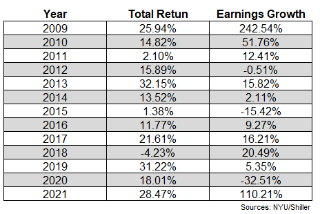
For example, U.S. stocks had a powerful run after the 2008–2009 financial crisis. Start your analysis in 2009
and it can look like an unstoppable bull market. Start it in 2008 and it suddenly includes a year that felt like
financial gravity got switched off. Start it in 2000 and you capture the dot-com bust, the global financial crisis,
and a decade that investors still refer to as a “lost decade.” Same market, different movie.
This is the first rule of the stock market Rorschach test: change the start date and you can tell almost any story.
It’s not cheating; it’s just incomplete storytelling. But incomplete storytelling is basically the national hobby
of investing Twitter and group chats everywhere.
End dates matter too (especially when emotions are loud)
If your chart ends right after a big rally, it can feel like the market is a money machine. If it ends right after a
crash, it can feel like the market is a trap. Investors are human, and humans are not famous for calmly evaluating
data when our brains are yelling, “DO SOMETHING!”
This is why market history often gets interpreted through the lens of whatever just happened. When markets are up,
people “discover” that stocks are safe long-term. When markets are down, people “realize” that everything is rigged.
In reality, the market has always been capable of both: long stretches of growth and gut-punch drawdowns.
Same Data, Opposite Conclusions: The Greatest Hits
“It’s all the Fed!” vs. “It’s all fundamentals!”
One of the most common debates goes like this:
- Team Monetary Policy: “Stocks only went up because interest rates fell and central banks pumped liquidity.”
- Team Fundamentals: “Stocks went up because companies grew earnings and innovation created real value.”
Both sides have a point. Easier monetary policy can support higher asset prices by lowering discount rates and making
safer yields less attractive. At the same time, companies can genuinely grow sales, improve productivity, expand margins,
and turn new technologies into profits.
The Rorschach part happens when people insist it must be only one thing. Markets are multi-causal.
Even when central banks are doing similar “easy money” policies, different countries can see very different outcomes
because demographics, productivity, corporate behavior, valuation starting points, and sector composition all matter.
“The U.S. is unstoppable!” vs. “Look at Japan!”
If you want optimism, you can point to how U.S. stocks have historically rewarded patient investors over long horizons.
If you want caution, you can point to Japan’s late-1980s bubble and the long road back after the peak.
The lesson isn’t “America good, Japan bad.” The lesson is that valuation, time horizon, and starting conditions matter.
“Markets always come back” is emotionally comfortingbut history shows that which market, when you bought,
and how you invested along the way can change the lived experience dramatically.
How Investors Accidentally “Lie With Statistics”
You don’t need a villain twirling a mustache to mislead people with market data. You just need a chart,
a strong opinion, and a willingness to ignore nuance. Here are the most common ways market history gets
turned into a choose-your-own-adventure book:
1) Ignoring dividends (a classic)
Price-only charts can understate long-term returns because they don’t include dividends. Total return matters.
Over decades, reinvested dividends can be the difference between “nice” and “wow.”
2) Mixing nominal and real returns
A 10% return sounds greatuntil inflation is running hot and your “real” (inflation-adjusted) return is much lower.
Any honest look at history should clarify whether returns are nominal or real.
3) Selecting a time window that flatters the argument
Want to prove stocks are risky? Show a crash. Want to prove stocks are safe? Show a 30-year chart.
Both are true in different contexts. The question is: what’s relevant to the investor’s actual timeline and goals?
4) Confusing “average” with “typical”
Long-term stock returns are often summarized with an average annual return. That’s helpful, but it can hide the fact
that the path is jagged. Averages don’t show drawdowns, volatility, or how uncomfortable the ride can feel.
5) Treating “past performance” like a prophecy
History can provide perspective, but it doesn’t hand out guarantees. Markets change, regimes shift, and relationships
evolve. Using history as a crystal ball is how you end up confidently predicting three of the last zero of the next
two recessions.
Market History: What It’s Actually Good For
If market history can be misused so easily, why look at it at all? Because used correctly, it’s incredibly valuable.
It can help you:
- Set realistic expectations about volatility and drawdowns.
- Understand market cyclesbooms, busts, recoveries, and the boring middle parts.
- Build a plan that can survive emotions, not just spreadsheets.
- Stay humble by reminding you that certainty is expensive in markets.
Market history is a map, not a GPS. It shows terrainmountains (bubbles), valleys (bear markets), and storms
(recessions). It does not tell you exactly what the weather will be next Tuesday.
Practical Guardrails: How Not to Fail the Inkblot Test
Match your time horizon to your risk
If you need money next year, the stock market is not your personal savings account with extra spice.
Stocks are volatile. Historically, the odds improve over longer holding periods, but nothing is guaranteed
on short timelines.
Diversify like you mean it
Diversification isn’t about maximizing bragging rights at parties. It’s about avoiding catastrophic “single-story”
risk. When one asset class or sector has a rough stretch, you don’t want your entire financial future trapped in it.
Rebalance (because your portfolio drifts while you’re busy living)
After big market moves, your portfolio can quietly morph into something you didn’t intendoften more aggressive
after a rally and more conservative after a crash (which is the opposite of helpful). Periodic rebalancing can
keep risk aligned with your plan.
Avoid market timing traps
Many studies and broker research pieces show a similar pattern: waiting for the “perfect” moment often costs more
than it saves. Some of the market’s best days cluster around its worst days, which makes in-and-out timing especially
punishing. The market doesn’t send a calendar invite that says, “Great day tomorrowdon’t be late.”
Watch the behavior gap
A painful irony of investing is that the market’s long-term returns can be decent while the average investor’s returns
lag behindoften because of bad timing driven by fear, greed, and headline-chasing. In plain English:
people buy high, sell low, and then wonder why “investing doesn’t work.”
Use history to build resilience, not predictions
The healthiest relationship with market history is this: “Bad things happen sometimes, and I can still be okay
if I plan for them.” That mindset is less exciting than a hot takebut it’s far more profitable over time.
Conclusion: Let History Inform You, Not Hypnotize You
Stock market history is a Rorschach test because it reveals more about the observer than the inkblot.
Optimists see recoveries. Pessimists see crashes. The truth is the market contains both, and it always has.
If you want “a wealth of common sense,” the goal isn’t to find the one chart that proves your opinion.
It’s to build a strategy that still works when the chart looks scary, boring, exhilarating, or confusing.
History’s best lesson is not what the market will do nextit’s what you are likely to do next when
emotions show up uninvited.
So the next time someone posts a market chart like it’s an inkblot test with a single correct answer,
take a breath. Ask what’s included, what’s missing, and what story the timeframe is trying to tell.
Then go back to the plan that doesn’t require being right on the internet.
Disclaimer: This article is for informational and educational purposes only and does not constitute financial advice.
of Experience: What the Rorschach Test Looks Like in Real Life
If you’ve ever tried discussing the stock market in a group chat, congratulationsyou’ve participated in a live
behavioral finance experiment. The same week, the same index, the same headlines, and suddenly everyone is a different
kind of investor psychologist.
One common experience: the “chart debate.” Someone shares a 10-year chart of the S&P 500 and declares,
“See? Long-term investing is easy.” Another person replies with a chart starting in 2000 and says,
“See? You can waste a decade.” They’re not really arguing about data. They’re arguing about which story feels true
based on what they’ve lived through, what they fear, and what they want to believe.
Another classic: the “cash comfort blanket.” After a market drop, people often feel relief holding cash.
It feels safe because the number doesn’t move. The experience is emotionally soothinguntil months pass and the market
recovers without them. Then the feeling flips: cash goes from comforting to frustrating. That swing is the Rorschach test
at work. The same asset (cash) can feel like “wisdom” or “regret” depending on what happens next.
There’s also the experience of “headline whiplash.” In calm markets, investors talk about discipline and long-term plans.
When volatility hits, those same investors start checking portfolios like it’s a social media feed. The urge to “do something”
ramps up precisely when the odds of doing something smart go down. Many investors later describe the same pattern:
the decision wasn’t driven by a spreadsheet; it was driven by the emotional need to reduce uncertainty right now.
A particularly revealing moment happens after a big rally. People who stayed invested feel validated. People who were cautious
feel left behind. Suddenly, risk looks smaller because the recent past was kind. Investors start anchoring on the idea that
“this time is different,” or they quietly increase bets in the hottest parts of the market because the last year made it look
painless. Then, when a pullback arrives (because pullbacks always arrive), the emotional math reverses. Risk feels huge again.
The most useful real-world experience, though, is watching what happens when someone follows a simple process for years:
automate contributions, diversify, rebalance occasionally, and keep a realistic view of risk. It’s not cinematic. There’s no
triumphant montage. But over time, it tends to beat the dramatic cycle of chasing performance and fleeing fear. In other words,
the “boring” investor often looks like a genius laternot because they predicted the future, but because they didn’t let the inkblot
tell them who they had to be this week.