Drawing a map sounds simple until you sit down with a blank page and realize the page is staring back like, “Well? Where’s the continent, genius?” The good news is that a map does not need to look like it was produced by a government agency, a fantasy novelist, and a laser printer working overtime. A useful map needs one thing above all: clarity.
Whether you want to draw a neighborhood map, a classroom map, a travel route, a treasure map, a fictional kingdom, or a simple map for a school project, the same basic ideas apply. A good map helps people understand where things are, how they connect, and what matters most. That means thinking about scale, symbols, direction, labels, distance, and the story your map is trying to tell.
This guide explains three practical ways to draw a map: a simple sketch map, a scaled map using a grid, and a polished digital or presentation-style map. Each method has its own personality. The sketch map is fast and friendly. The grid map is more accurate and organized. The digital map is clean, flexible, and perfect when you want your work to look less like “napkin art at lunch” and more like “I definitely planned this.”
Why Learning How to Draw a Map Still Matters
In a world full of GPS apps, it may seem old-fashioned to learn how to draw a map by hand. But map drawing is still useful because it teaches spatial thinking. You learn how places relate to each other, how distance changes meaning, and how design choices can make information easieror harderto understand.
A map is not just a picture of land. It is a visual explanation. A road map explains movement. A floor plan explains layout. A weather map explains patterns. A fantasy map explains a world that does not exist yet but somehow already has five mountain ranges and a suspiciously dramatic volcano. No matter the topic, the goal is the same: help the reader understand space quickly.
Before choosing a method, decide what your map is for. Are you helping someone get from the parking lot to the soccer field? Showing the best route through a park? Creating a fictional island for a story? Mapping your bedroom so you can prove the laundry pile is technically a “geographic feature”? Purpose controls everything else.
Essential Map Elements You Should Include
Most useful maps include several core elements. You do not need every element for every map, but you should know what they do before deciding what to leave out.
Title
The title tells readers what the map shows. “My Town” is fine. “Downtown Walking Route from the Library to Maple Park” is better because it gives the map a clear job.
Orientation
Orientation shows direction. This is usually done with a north arrow or compass rose. On casual maps, a simple arrow marked “N” is enough. On decorative maps, a compass rose can add style, especially if you are drawing a fantasy world and want the map to look like it was found in a dragon’s filing cabinet.
Scale
Scale explains how map distance relates to real-world distance. For example, one inch on the map might represent one mile in real life. Scale can be shown as words, a ratio, or a scale bar. If your map is only a rough sketch, you may write “not to scale.” That phrase is the mapmaker’s polite way of saying, “Please do not measure this with a ruler and start a lawsuit.”
Legend or Key
A legend explains symbols. If a blue line means a river, a green patch means a park, and a dotted red line means “best walking route,” the legend should say so. Symbols save space, but only if readers understand them.
Labels
Labels name places, roads, buildings, landmarks, rivers, trails, regions, or features. Good labels are easy to read and placed close to the feature they describe. If your label has to be decoded like a secret message, it needs fixing.
Grid or Coordinates
A grid divides the map into squares or coordinate zones. It helps readers locate places more accurately. A simple letter-number grid, such as A1, B2, and C3, works well for classroom maps, event maps, park maps, and treasure maps.
Sources and Date
If your map is based on real information, include where the information came from and when it was made. Streets change, buildings appear, trails close, and the world has a habit of rearranging itself when nobody asked.
Way 1: Draw a Simple Sketch Map
A sketch map is the fastest and friendliest way to draw a map. It does not need perfect scale. It does not require software. It does not ask you to understand projections, coordinate systems, or why printers wait until the last minute to run out of ink.
This type of map is best for simple directions, memory maps, classroom activities, event layouts, quick neighborhood guides, or fictional places. The goal is not mathematical perfection. The goal is communication.
Step 1: Choose the Area
Start by deciding the boundaries of your map. Are you drawing one room, one school, one neighborhood, one hiking trail, or one imaginary island? Keep the area small enough to manage. A map of “the whole world” sounds exciting until you realize you have to fit the Pacific Ocean on notebook paper.
Step 2: Mark the Biggest Features First
Begin with major shapes: roads, rivers, coastlines, buildings, parks, mountains, paths, or property lines. Draw lightly with pencil so you can adjust as needed. Big features are the skeleton of the map. Smaller details come later.
For a neighborhood sketch map, draw the main streets first. For a park map, draw the trails and entrances. For a fantasy map, block in the coastline, mountain ranges, forests, rivers, and major settlements. Do not worry about decoration yet. First, make sure the place makes sense.
Step 3: Add Landmarks
Landmarks help readers orient themselves. These might include a school, library, bridge, fountain, store, parking lot, trailhead, castle, dragon cave, or suspicious wizard tower. Choose landmarks people would actually notice.
Step 4: Use Simple Symbols
Symbols make sketch maps easier to read. A small tree can represent a park. A square can represent a building. A dashed line can represent a walking path. A star can mark a destination. Keep symbols simple. If your hospital symbol looks like a haunted toaster, your readers may become concerned.
Step 5: Add Direction and Labels
Draw a north arrow if direction matters. Add labels for important roads, places, and features. Write clearly, and avoid covering up the features you just drew. If necessary, use arrows or small callout lines.
Step 6: Create a Small Legend
If you used more than a few symbols, add a legend. Place it in an empty corner. The legend does not need to be fancy. It just needs to answer the reader’s question: “What does this little blob mean?”
Best Uses for a Sketch Map
A sketch map works beautifully when speed matters more than precision. It is great for giving directions, planning a story setting, mapping a campsite, explaining a room layout, or showing the basic relationship between places. It is also ideal for beginners because it teaches the core mapmaking habit: simplify what matters and leave out what does not.
Way 2: Draw a More Accurate Map Using a Grid and Scale
If a sketch map is a friendly doodle, a scaled grid map is the organized sibling who owns a label maker. This method is better when distance, proportion, and placement matter. You can use it for school projects, garden plans, room layouts, property sketches, hiking routes, or any map where “close enough” is not quite enough.
Step 1: Gather Reference Information
Before drawing, collect the information you need. You might use a printed map, satellite image, field notes, measurements, photographs, or your own observations. For a room map, measure walls and furniture. For a garden map, measure beds, paths, fences, and water sources. For a town map, use reliable public references and simplify carefully.
Step 2: Choose a Scale
Scale is the heart of an accurate map. Pick a relationship that fits your page. For example, one inch could equal ten feet for a room or garden map. One inch could equal one mile for a neighborhood or park map. The right scale depends on the size of the real area and the size of your paper.
Once you choose a scale, write it down. Then stick to it. Changing scale halfway through a map is like changing shoe size halfway through a marathon: technically possible in a cartoon, but not recommended.
Step 3: Draw a Grid
Use graph paper or lightly draw your own grid. Each square should represent a specific real-world distance. For example, one square might equal five feet, ten feet, or one block. A grid helps you place objects more accurately and keeps the map from slowly drifting into abstract art.
Step 4: Transfer Major Features
Start with the largest features and work from general to specific. Draw boundaries first, then roads, paths, buildings, water, hills, fields, or rooms. Use the grid to keep proportions consistent. If a building is twice as long as another in real life, it should look about twice as long on the map.
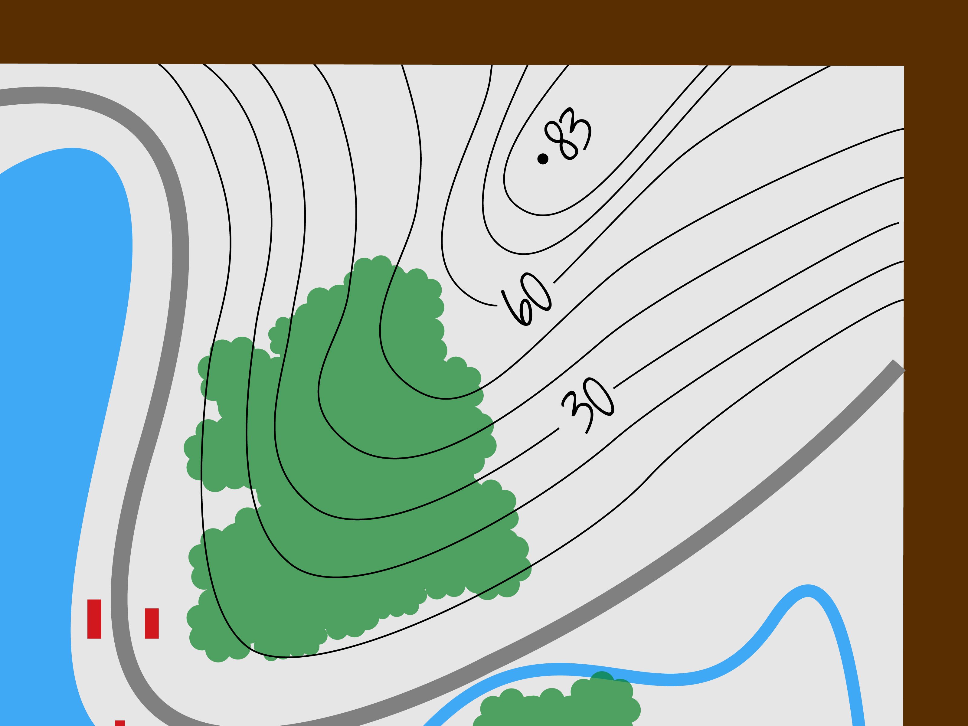
Step 5: Add Contours or Elevation When Needed
If you are drawing landforms, consider showing elevation. Topographic maps use contour lines to connect points of equal elevation. Lines close together indicate steeper slopes, while lines farther apart suggest gentler land. You do not need professional survey data for a simple project, but contour-style lines can help show hills, valleys, ridges, and depressions.
Step 6: Build a Clean Legend
The more detailed your map becomes, the more important the legend becomes. Use consistent symbols for roads, trails, water, buildings, vegetation, boundaries, and special points. Place the legend where it does not block important information.
Step 7: Add a Scale Bar
A scale bar is especially useful because it stays helpful even if the map is resized. If someone prints your map smaller or larger, a written scale like “one inch equals one mile” may become wrong, but a scale bar grows or shrinks with the map. That makes it a practical choice for maps that may be copied, scanned, or shared online.
Best Uses for a Grid and Scale Map
This method is excellent for maps that need accuracy without professional software. Use it for planning a backyard garden, designing a room arrangement, drawing a campus map, outlining a walking route, or completing a geography assignment. It takes more time than a sketch map, but the result is easier to measure and trust.
Way 3: Draw a Digital or Presentation-Ready Map
A digital map can be as simple as a drawing made in a design app or as advanced as a GIS map built with geographic data. Digital mapping is the best method when you want clean lines, editable layers, reusable symbols, polished labels, and a final result that looks ready for a report, blog post, classroom handout, or website.
You can use beginner-friendly design tools, online map platforms, or GIS software. The method depends on how accurate and data-based your map needs to be. A simple event map may only require shapes and icons. A population map, flood-risk map, or political boundary map may require reliable geographic data.
Step 1: Define the Map’s Purpose
Digital tools make it tempting to add everything. Resist. A map with every road, label, icon, color, pattern, and decorative mountain can become unreadable. Start with one main purpose. Are you showing a route, comparing regions, explaining a place, or designing a fictional world?
Step 2: Choose the Right Base
For real-world maps, start with a reliable base map or boundary file. Public geographic data can provide coastlines, roads, political boundaries, census areas, water features, and more. For simple thematic maps, generalized boundary files are often easier to display because they use fewer details and load faster.
Step 3: Work in Layers
One big advantage of digital mapping is layers. You can keep roads on one layer, labels on another, rivers on another, and symbols on another. Layers let you edit one type of feature without damaging everything else. This is the digital equivalent of not spilling coffee on your entire paper map.
Step 4: Use Visual Hierarchy
Visual hierarchy means making the most important information stand out first. If your map is about a hiking route, the route should be more noticeable than minor background roads. If your map is about rivers, water should be easy to find. Use size, line weight, spacing, contrast, and label placement to guide the reader’s eye.
Step 5: Keep Colors Meaningful
Color should help, not decorate randomly. Blue usually suggests water. Green often suggests parks, forests, or vegetation. Gray works well for background roads or less important features. Bright colors should be reserved for important information. If every feature screams for attention, the map becomes a committee meeting in crayon form.
Step 6: Add Map Elements
A polished digital map should usually include a title, legend, scale bar, north arrow when useful, labels, source note, and date. Not every map needs a north arrow, especially if north is obvious or the map is highly schematic. But every map needs enough context for readers to understand what they are seeing.
Step 7: Proofread the Map
Proofreading a map is just as important as proofreading an article. Check spelling, symbol consistency, missing labels, confusing colors, crowded text, and scale. Make sure the legend matches the map. Make sure labels do not cover important features. Make sure the title describes the actual content, not the map you meant to make before your project evolved three times.
Best Uses for Digital Maps
Digital maps are ideal for presentations, reports, blog posts, travel guides, infographics, classroom projects, business materials, and web publishing. They are also best when you need to revise the map later. Instead of redrawing everything, you can move labels, change colors, hide layers, or export a fresh version.
Common Map Drawing Mistakes to Avoid
Trying to Show Too Much
The most common beginner mistake is adding too much information. A map is not a junk drawer. It should not contain every possible detail just because there was space. Choose the details that support the purpose of the map.
Forgetting the Legend
If your map uses symbols, colors, patterns, or line styles, explain them. A map without a legend can feel like a game where someone lost the instruction booklet.
Ignoring Scale
Not every map needs perfect scale, but readers should know whether the map is accurate or approximate. If it is not to scale, say so. If it is to scale, include a scale bar or clear scale statement.
Using Hard-to-Read Labels
Labels should be readable at the final size. A map that looks fine zoomed in may become a tiny alphabet soup when printed or posted online. Test the map at real viewing size before calling it finished.
Choosing Random Colors
Color affects meaning. Use it carefully. Too many colors can confuse the reader, while too little contrast can make important information disappear. Aim for balance, not fireworks.
How to Choose the Best Map Drawing Method
Choose a sketch map when you need speed, simplicity, or creativity. Choose a grid and scale map when you need better accuracy. Choose a digital map when you need polish, data, or easy editing.
For example, if you are explaining how to get from your house to a nearby park, a sketch map is enough. If you are planning raised garden beds in a backyard, a grid map is better because measurements matter. If you are creating a map for a blog post about the best walking routes in a city, a digital map will look cleaner and more professional.
The best mapmakers are not the people who include the most details. They are the people who make good decisions. What should be shown? What should be simplified? What should be labeled? What can be left out? Those choices turn a drawing into a map.
Practical Example: Drawing a Neighborhood Map
Imagine you want to draw a map showing a walking route from a school to a community garden. Start with the purpose: helping walkers follow the safest and easiest route. Next, choose the area: the school, surrounding streets, crosswalks, bus stops, the garden, and nearby landmarks.
For a sketch version, draw the main streets, mark the school and garden, add a dotted line for the walking route, and include a simple legend. For a scaled version, use graph paper and estimate distances between blocks. For a digital version, use a base map, trace the route, add labels, and style the walking path so it stands out.
In all three versions, avoid unnecessary details. You probably do not need every driveway, mailbox, tree, and squirrel with strong opinions. You do need street names, crossing points, destination labels, direction, and a clear route.
Experience-Based Tips for Drawing Better Maps
After drawing maps for school projects, room plans, travel routes, and imaginary places that somehow always end up with a mountain range shaped like a sleeping cat, one lesson becomes clear: maps improve when you start messy and finish carefully. The first version should be rough. The final version should be thoughtful.
One helpful habit is to draw the first draft quickly. Do not try to make it beautiful. Give yourself permission to make a lopsided, awkward, slightly confused version. This rough draft helps you discover what belongs on the map. You may realize a road should curve differently, a label needs more space, or the destination is too close to the edge. The rough draft is not failure. It is rehearsal.
Another useful experience is walking through the area before finalizing a real-world map. If you are drawing a map of a school, park, neighborhood, or event space, physically moving through the place helps you notice details that photos or memory can miss. You might find that a “main entrance” is not the entrance most people use, or that a path looks obvious on paper but is hidden behind shrubs in real life. Maps are about people using space, not just space existing politely.
When drawing fictional maps, it helps to think like nature before thinking like decoration. Rivers usually flow from higher ground to lower ground. Roads often connect settlements, water sources, passes, ports, and resources. Mountains influence climate and travel. A fantasy map becomes more believable when features have reasons to exist. The dragon can still live wherever it wants, of course. Dragons are not known for zoning compliance.
For hand-drawn maps, pencil is your best friend. Start light, then darken the lines you want to keep. Use tracing paper if you want to test different layouts. If a coastline looks too smooth, add small irregular curves. If a city map feels empty, add blocks, parks, and landmarks. If the page feels crowded, remove details instead of shrinking labels until they resemble ant handwriting.
For digital maps, save versions. This is not glamorous advice, but it is the kind that prevents emotional weather events. Save a basic version, a labeled version, and a final version. If you experiment with colors or symbols and accidentally create something that looks like a pizza menu during a thunderstorm, you can go back.
Finally, show your map to someone else before calling it done. Ask them what they notice first, what confuses them, and whether they can use the map for its intended purpose. If they understand it quickly, your map is working. If they stare at it silently and tilt their head like a confused golden retriever, revise. A map is successful when it helps someone else see what you meant.
Conclusion
Learning how to draw a map is really learning how to organize space. You can make a quick sketch map for simple directions, a grid-based map for better accuracy, or a digital map for polished presentation. No matter which method you choose, the strongest maps share the same qualities: a clear purpose, readable labels, useful symbols, sensible scale, and design choices that guide the reader instead of overwhelming them.
Start simple. Add only what matters. Use a title, legend, direction marker, and scale when appropriate. Proofread your map before sharing it. And remember: a good map does not need to be perfect enough for a satellite engineer. It just needs to help people understand where things are and how to get from “I’m lost” to “Oh, there it is.”