Wallpaper usually asks to be seen. It arrives with giant peonies, jungle cats, geometric fireworks, or enough tropical foliage to make the living room believe it has relocated to Costa Rica. Fayce Textiles takes a quieter route. With its Summer and Winter embroidered wallpapers, the Massachusetts-based nd plenty of room for the imagination to wander.
Designed by Kim Rosen, the two embroidered wallcoverings are exercises in restraint. Summer combines coral and teal stitching with natural Paperweave, while Winter places black embroidery against a soft white Paperweave ground. Both present simplified scenes of scattered trees and shadows. Nothing shouts. Nothing performs an elaborate wallpaper tap dance. Yet the closer you look, the more the surfaces reveal.
That is the clever thing about Fayce Textiles wallpaper: subtlety is not treated as an absence of design. It is the design.
Meet Fayce Textiles and Designer Kim Rosen
Kim Rosen’s path to textile and wallpaper design helps explain why Fayce’s patterns feel unusually illustrative. After studying at the Fashion Institute of Technology and the Savannah College of Art and Design, Rosen worked as an art director and spent years as an illustrator. Her transition into interiors brought that background in drawing, composition, and visual storytelling directly onto walls and fabrics.
Instead of approaching wallpaper as a flat repeating graphic, Rosen often starts with line work and the emotional possibilities of a scene. Fayce’s design philosophy places considerable faith in quiet patterns and restrained color. It is an approach that feels especially refreshing in an era when the phrase “statement wall” can occasionally translate to “the wall has seized control of the building.”
Summer and Winter demonstrate how delicate hand-drawn sensibilities can be reinterpreted through embroidery. Thread introduces physical dimension. The woven Paperweave ground adds another layer of irregular texture. Light then becomes a third design material, changing the appearance of the stitches and shadows throughout the day.
Summer: A Landscape Stitched in Coral and Teal
A warm season without the obvious clichés
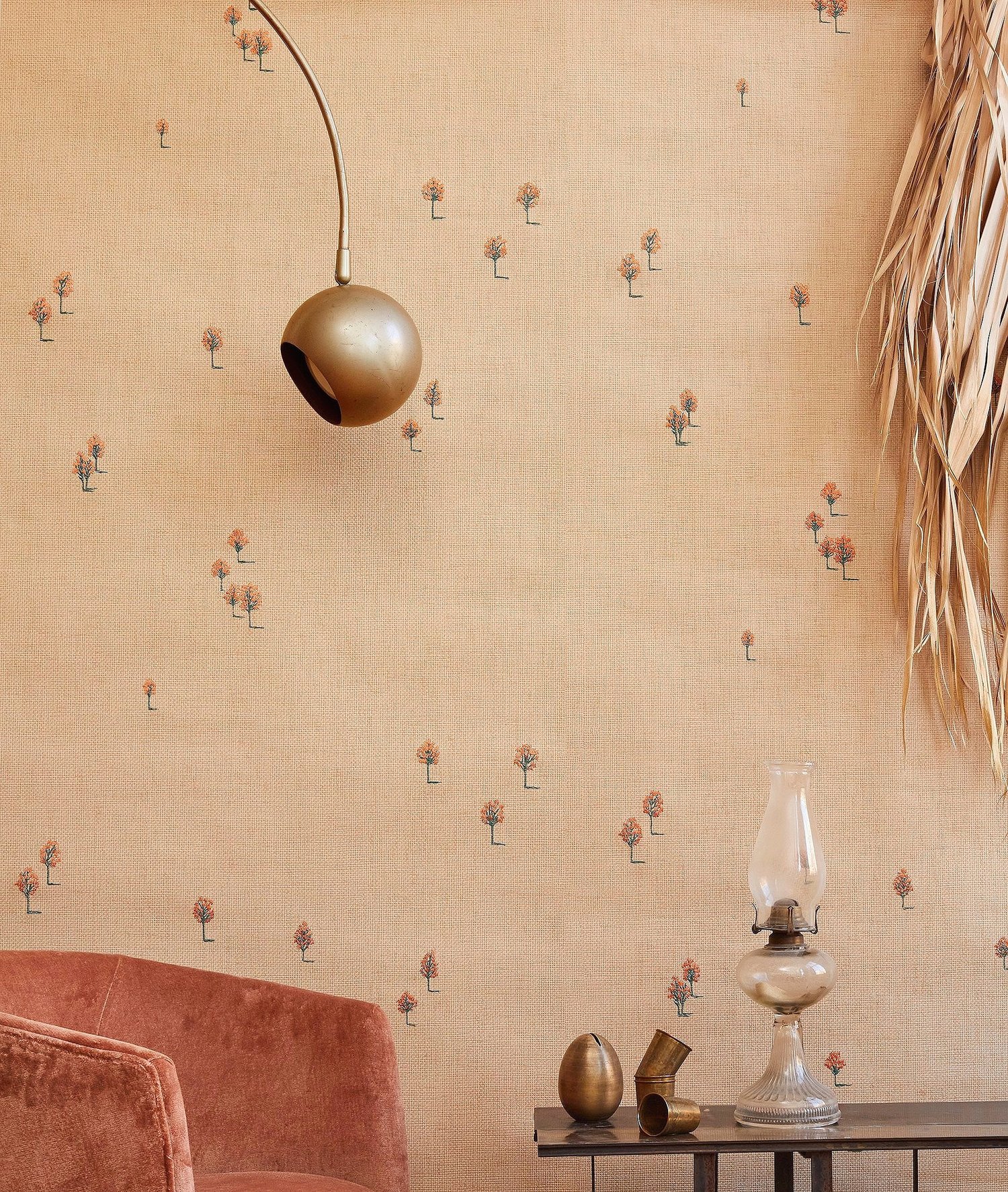
The Summer embroidered wallcovering is inspired by warm days gradually turning into warm summer nights. That mood matters because the pattern does not rely on predictable seasonal symbols. There are no giant lemons. No flamingos are wearing sunglasses. You will not find the word “BEACH” printed across a decorative surfboard.
Instead, Summer uses a minimalist landscape of trees and elongated shadows. Coral and teal thread is embroidered onto natural Paperweave, introducing small sparks of color against an organic, quietly varied background.
The coral has a sun-warmed character, while teal provides a cooler counterpoint. Together, the colors suggest the transitions of a summer day: bright afternoon, changing sky, longer shadows, and the calm period before evening fully arrives.
Why the embroidery changes everything
Printed lines can certainly imitate stitching, but actual embroidery behaves differently. Thread sits above the wallcovering’s surface. It catches side light. It casts microscopic shadows. From across a room, the design appears spare and graphic; from a few feet away, its construction becomes part of the experience.
This dual personality makes Summer particularly suited to interiors built around natural materials. Imagine it with pale oak furniture, woven shades, linen upholstery, handmade ceramics, or a faded vintage rug. The wallpaper contributes pattern without competing with every object in the room for the final word.
It could also work beautifully behind a streamlined bed with white bedding and coral accents. In a dining room, teal glassware or painted millwork might pick up the cooler embroidery. The goal is not to match every stitch as if preparing for an interior-design spelling bee. A few subtle color echoes are enough.
Winter: Black Thread Across a Snowy White Ground
Minimalism with an emotional temperature
If Summer feels expansive and warm, Winter embroidered wallpaper is quieter and more contemplative. Black thread is stitched onto white Paperweave, creating a reduced landscape inspired by views across broad snowy fields.
The contrast is simple, but not harsh. Because the background is woven rather than perfectly flat, the white contains texture and visual variation. The black embroidery feels more like a line drawing floating across a tactile surface than a conventional black-and-white print.
Winter’s trees and shadows offer just enough information to establish a landscape. The rest is deliberately missing. Is the imagined place in New England? Scandinavia? Somewhere near a childhood sledding hill where one mitten inevitably disappeared? The design does not answer. That openness is essential to its charm.
A wallcovering for rooms that need calm, not emptiness
There is a significant difference between a calm room and an unfinished room. Winter helps bridge that gap. It can provide visual interest in an otherwise neutral space without disrupting a limited palette.
Consider a bedroom furnished with blackened wood, soft wool, warm white bedding, and a sculptural paper lamp. Plain white walls might feel too sterile; a dense pattern might make the room busy. Winter lands between those extremes.
It also offers an elegant backdrop for art. Since the embroidered pattern is composed of fine lines and open space, carefully chosen framed pieces can coexist with it. Black frames would create a direct dialogue with the stitching, while pale wood frames could soften the overall composition.
Summer Versus Winter: Two Seasons, One Visual Language
Summer and Winter may use different palettes, but they clearly belong to the same family. Both feature minimalist landscapes, sparse groups of trees, and stretched shadows. Their patterns are designed to encourage daydreaming rather than provide a literal illustrated narrative.
Summer wallpaper has greater color warmth and a slightly more playful energy. It suits interiors that already lean toward organic modern, relaxed coastal, eclectic, or contemporary styles. The natural Paperweave gives the coral and teal stitching an earthy foundation.
Winter wallpaper is more graphic. Black thread on white creates sharper visual definition, making it easy to incorporate into monochromatic interiors, modern bedrooms, quiet studies, and spaces featuring sculptural furniture.
Choosing between them may come down to the atmosphere you want rather than the actual season outside. There is no law requiring Summer to disappear in October. The wallpaper police are terribly understaffed.
Paperweave Gives the Walls a Textile-Like Presence
The Paperweave foundation is crucial to the collection. Textured wallcoverings have a dimensional quality that conventional smooth paper cannot fully reproduce. Natural-looking woven surfaces respond to changing daylight, and their small variations help a room feel layered rather than digitally perfect.
That material quality is particularly important with a reduced design. When a pattern contains only a few carefully placed motifs, the background has to contribute something. Here, the Paperweave acts almost like an artist’s canvas.
This explains why embroidered and textile-inspired wallcoverings are so interesting in contemporary interiors. Homeowners and designers increasingly use walls to add tactile depth, particularly in rooms dominated by smooth flooring, plain cabinetry, glass, and streamlined furniture.
A woven wall surface can provide the visual equivalent of adding linen curtains or a nubby wool throw. You may not consciously identify every fiber, but the room suddenly feels less flat.
Technical Details Worth Knowing Before Installation
Beautiful wallpaper deserves a little planning. Summer and Winter are specialty embroidered Paperweave wallcoverings rather than casual peel-and-stick products designed for a Saturday afternoon, two iced coffees, and dangerously optimistic confidence.
Both designs feature a 33-inch horizontal pattern repeat and a 31.5-inch vertical repeat. The pattern width is 33 inches on paper measuring 36 inches wide. The wallcoverings are supplied untrimmed in individually wrapped eight-yard rolls, with an eight-yard minimum.
Fayce notes that there is no printed selvedge and recommends trimming approximately half an inch to one and a half inches from the horizontal edges before installation, although trimming is not stated as mandatory. Depending on the desired appearance, the pattern may be handled as a random, half-drop, or straight match.
Those choices can affect the final rhythm of the landscape. A professional installer experienced with natural or specialty wallcoverings can evaluate the room, examine the material, and determine how to position the panels so the trees and shadows flow attractively across the walls.
Where should embroidered Paperweave be used?
The official specifications classify these wallcoverings for residential and low-traffic commercial locations. That makes bedrooms, dining rooms, studies, formal living rooms, private offices, and carefully chosen feature walls logical possibilities.
High-moisture areas deserve more caution. Natural woven wallcoverings generally require thoughtful placement, and Fayce specifically warns against using water to clean its Paperweave. A steamy bathroom or a wall repeatedly splashed beside a kitchen sink is therefore not the most sensible place to let delicate embroidery live its best life.
How to Decorate with Fayce Textiles Summer Wallpaper
Keep the supporting colors slightly imperfect
Summer’s natural ground, coral, and teal look strongest with nuanced colors rather than aggressively bright versions of the same hues. Choose clay, faded terracotta, dusty aqua, muted blue-green, warm ivory, or soft tan.
A coral-orange lacquered table might be exciting, but covering the room with identical coral accessories could make the design feel over-coordinated. Instead, allow the thread colors to reappear casually in a ceramic bowl, striped pillow, abstract artwork, or vintage textile.
Mix in honest materials
Wood, rattan, linen, wool, and aged metal complement the woven quality of Paperweave. A Summer-covered dining room could include a simple oak table, rush-seat chairs, linen curtains, and a contemporary pendant. The result would feel collected and textural without drifting into themed décor.
For a more modern interpretation, pair the wallpaper with a low-profile sofa, polished metal lighting, and bold contemporary art. The embroidered landscape softens hard edges and keeps sleek furniture from feeling overly clinical.
How to Decorate with Fayce Textiles Winter Wallpaper
Use black details strategically
The black stitching in Winter creates natural opportunities for repetition. A black reading lamp, slim metal curtain rod, dark chair frame, or charcoal bedside table can connect to the embroidered lines.
You do not need black furniture everywhere. In fact, restraint is the point. Three or four carefully positioned dark details may give the whole room visual structure.
Add warmth through texture
Because Winter has a white and black palette, tactile materials prevent the space from becoming cold. Bouclé, felted wool, mohair, warm oak, handmade pottery, and softly rumpled linen all work well.
Lighting is equally important. Warm lamps placed near the wall can emphasize the dimensional stitching after sunset. A shaded table lamp or wall sconce may produce soft raking light that reveals textures less obvious under bright overhead illumination.
Why Minimalist Landscape Wallpaper Can Feel So Personal
Nature-inspired wallpaper is hardly new. For centuries, walls have carried vines, flowers, trees, birds, garden scenes, and imagined landscapes. What changes is the visual language used to interpret nature.
Summer and Winter reduce the landscape almost to visual shorthand. A tree is not presented with botanical precision. Shadows do not document a particular hour on a particular date. The scenes function more like prompts.
This gives viewers room to attach memories to the design. One person might see the edge of a summer campground. Another may imagine an evening drive past open fields. Winter might recall a quiet morning after snowfall, a cross-country ski trail, or simply the rare pleasure of looking outside and realizing a canceled appointment is now completely justified by weather.
Interior design becomes more memorable when objects and surfaces encourage those private associations. A home filled only with technically attractive products can resemble a showroom. A home filled with materials that trigger imagination begins to acquire personality.
The Experience of Living with Summer and Winter Embroidered Wallpaper
First impressions happen from across the room
Imagine entering a bedroom covered in Winter for the first time. From the doorway, you probably notice the landscape before the embroidery technique. Dark linear marks travel across the pale walls, giving the room a quiet horizon. The pattern registers almost like an oversized pen-and-ink drawing.
Then you move closer.
The lines have physical depth. The Paperweave is visibly textured. What initially seemed like a simple graphic becomes a construction of thread and woven material. This transition from distant image to close-up detail is one of the most rewarding experiences offered by tactile wallpaper.
Summer creates a similar discovery but with color. In daylight, the natural ground supports the coral and teal threads with an earthy warmth. As afternoon light shifts, the raised embroidery may become more pronounced. By evening, under lamps, certain stitches can appear stronger while other parts of the landscape recede.
The wall does not literally move, of course. That would be an entirely different article and possibly a call to a structural engineer. The visual emphasis changes because texture responds to light.
The room feels decorated before it is heavily furnished
One practical experience with distinctive wallcovering is realizing that fewer decorative objects may be necessary. A room with embroidered walls already contains line, material, color, and visual rhythm.
Picture a small home office with Winter behind a simple writing desk. Add a comfortable chair, black task lamp, oak shelf, and one ceramic vessel. The scene can feel finished without twelve framed motivational quotes encouraging you to “HUSTLE.”
Summer can have the same simplifying effect in a guest room. A plain upholstered headboard, cotton bedding, and two modest bedside lamps might be enough. The wallpaper supplies the personality.
For homeowners who love minimal interiors but fear blandness, this is an important lesson: minimalism does not require perfectly smooth white surfaces. Material detail can replace decorative clutter.
You start noticing the wall at different times of day
Textured materials invite observation. Morning light coming from a side window may emphasize one section of embroidery. At noon, more even illumination can flatten the contrast slightly. At night, a nearby lamp creates a different pattern of tiny highlights and shadows.
This makes lighting placement worth testing before the room is declared complete. A movable floor lamp can be useful during the early decorating phase. Place it in different areas after sunset and observe how the wall responds.
A client or homeowner may discover that a lamp originally intended for a reading corner looks better several feet away, where its light grazes the embroidery. That is the sort of detail rarely captured in a small wallpaper sample photographed under retail lighting.
Touch becomes tempting, so care becomes part of the experience
An embroidered surface practically invites fingers. Guests may instinctively lean closer or gently touch the wall because the thread looks so different from printed paper. In a private bedroom or study, this is usually manageable. In a busy commercial corridor populated by hundreds of curious hands, perhaps less so.
Fayce recommends removing accumulated dust from the Paperweave with a vacuum and specifically advises against water cleaning because the vegetable dyes used in the handwoven wallcovering can bleed or streak. Living with the product therefore involves treating the walls more like a textile surface than washable vinyl.
That care requirement may actually influence how a room is used. A dining room installation might avoid placing a buffet where chairs constantly scrape the wall. Furniture can be positioned with a little breathing room. Children armed with grape juice and creative ambition may be redirected toward another surface.
The strongest experience is the invitation to imagine
Ultimately, the memorable quality of Summer and Winter is not simply that they are embroidered. Embroidery is the technique; imagination is the larger idea.
The landscapes deliberately leave narrative gaps. There are trees, but no detailed houses. Shadows, but no clearly identified people casting them. Space, but no instructions about what is supposed to happen there.
Spend time in a room with that kind of pattern and the empty spaces begin doing as much work as the stitched forms. You may see a different scene depending on your mood, the weather outside, or the memory that happens to surface.
That makes Fayce Textiles’ seasonal wallcoverings unusually suited to slow interiors: spaces designed to become more interesting with attention rather than deliver every visual effect in the first three seconds.
Summer asks you to imagine how a warm day unfolds. Winter asks what might exist beyond a broad snowy field. The walls provide the beginning of the story. Happily, they decline to write the final paragraph for you.
Conclusion: Quiet Wallpaper That Rewards a Closer Look
Summer/Winter embroidered wallpapers from Fayce Textiles prove that a wallcovering does not need enormous motifs or theatrical color to transform a room. Kim Rosen’s minimalist landscapes use delicate embroidery, woven Paperweave, sparse trees, and elongated shadows to build atmosphere through subtle details.
Summer feels warm, relaxed, and gently colorful, with coral and teal thread stitched onto a natural ground. Winter is more meditative, pairing black embroidery with white Paperweave to suggest distant snowy fields. Both designs reward viewers twice: first as calm landscapes seen across a room and again as richly tactile surfaces discovered at close range.
For bedrooms, studies, dining rooms, or other lower-traffic interiors where texture can be appreciated and carefully maintained, these wallcoverings offer an intriguing alternative to conventional printed wallpaper. They are decorative without being loud, artistic without feeling like murals, and seasonal without becoming literal.
Sometimes the most interesting wall is not the one demanding attention. It is the one quietly giving your mind somewhere else to go.